Custom Typeface for Carrefour Food Labels
A legal labelling rule shaped a typeface family
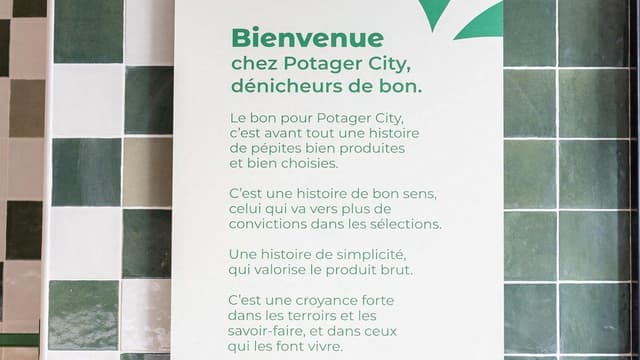
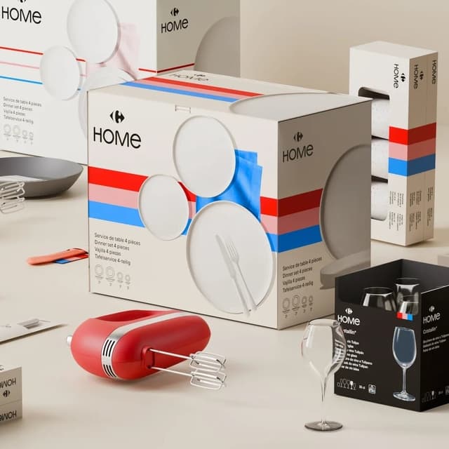
Origin Super Condensed began as a commission for the Carrefour retail group, addressing a French legal requirement that a food product's geographical origin be set at the same point size as its price. Jean-Baptiste Levée responded with an extra-narrow design, later extended with a lowercase informed by mid-20th-century gothics from foundries including Stephenson Blake and Stempel. The released family spans five weights, each including a Backslant variant, with broad figure and language support.
Set in Origin Super Condensed
Insights
- The commission arose from a specific French food-labelling regulation requiring geographical origin text to match the point size of the price, forcing extreme compression.
- The lowercase was developed after the initial commission, drawing on mid-century gothic models from Stephenson Blake and Stempel.
- Each of the five weights includes a Backslant variant, described as an unusual structural choice for a compressed family.
- Extensive figure and language support means the family can be used in sizes and settings where other ultra-condensed typefaces typically cannot.
1 / 7Swipe
Keep exploring
Related cases