Visual Identity for Google's NeurIPS 2025 Presence
Google let its research papers become the campaign.
Polar, Ltda. developed a visual system for Google's presence at NeurIPS 2025, one of the world's largest AI research conferences. Created with 1st Ave Design and SpecialGuest, the identity launched at the event and continues across Google's global event program.
Insights
- Polar built the campaign out of Google's own bibliography: the titles of the accepted papers were expanded into From… to… constructions, so the content of the campaign doubles as its own evidence.
- The stakes were unusual: Google attended NeurIPS 2025 as a diamond sponsor with 175 accepted papers, and the brief was how to look credible in front of a room that is, by definition, better informed than the sponsor.
- The visual system’s core is cellular automata, using grids of cells that create complex patterns from simple rules—a deliberate reference to computation theory that would resonate with AI researchers rather than feel decorative.
- Google’s branding was kept restrained; the identity relied mainly on colour and typeface while the research-led system carried the narrative, reinforcing a quiet, credible presence across the event.
- A standout experiential detail was the arcade game developed with AI: Google at an AI conference entertaining AI researchers with a game built by AI, extending the concept from graphics into interaction.
- It was not a one-off stand dressing. The system launched at NeurIPS 2025 in San Diego and stayed in use across Google's other AI events worldwide through the 2025–2026 calendar, and the same visual logic was extended into a digital talent-acquisition campaign — a conference identity promoted into an events-and-recruitment system.
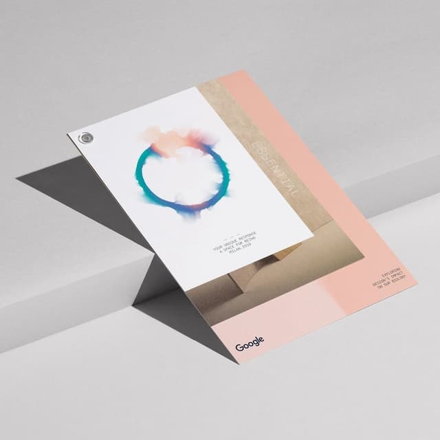
- The graphics work as a pair of opposites rather than one motif: from the rational grid of the cellular automata, the system moves to a fluid, organic reading of the same translation, and the two appear sometimes alone, sometimes combined. The only thing holding it to Google is colour — the institutional palette in flats and gradients, with Google Sans as the typeface.
- It was a three-studio build: Polar with 1st Ave Design on the visual side and SpecialGuest on strategy, content and booth activations, spanning environmental design and signage for the booth, print, out-of-home and the AI-built arcade game.
1 / 5Swipe