Brand Identity Evolution for Harry's
Harry’s grows up with a serif wordmark and a familiar mammoth.
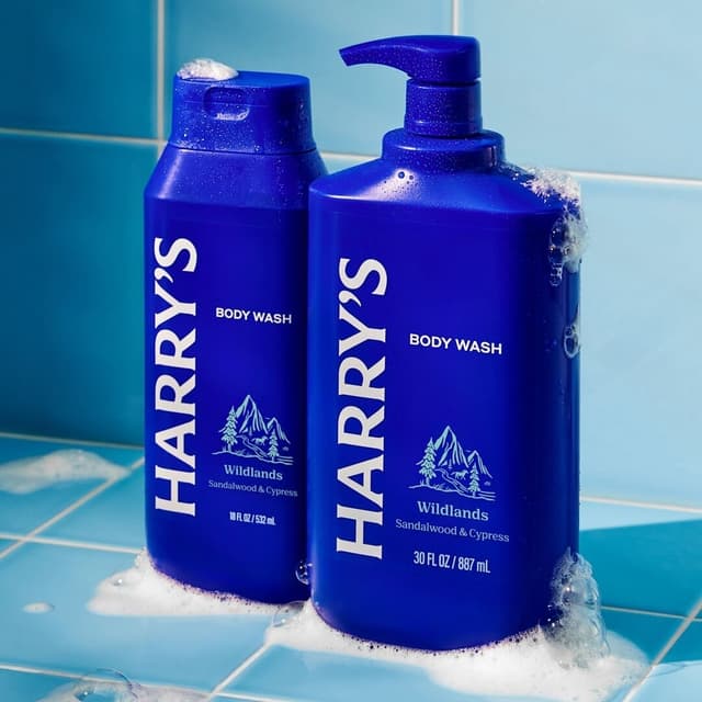
Mythology returned to Harry’s after a decade to evolve the identity it had helped establish at the company’s beginning. The original collaboration, with a co-founder of Warby Parker, included the company name and brand world for an everyday shaving and grooming business. The new work responds to a different stage in Harry’s development: an established brand seeking a more mature presence in a crowded men’s care category. A serif wordmark gives the name a revised typographic character, while an updated Mammoth logomark carries a familiar brand asset into the new system. The intent is to balance maturity with approachability. Project applications show the identity across grooming products and razor packaging, connecting the revised marks to the everyday objects through which customers encounter Harry’s.
Insights
- Mythology’s return follows its original naming and brand-world work for Harry’s, giving the refresh a direct connection to the company’s beginnings.
- The serif wordmark and revised Mammoth mark address two roles together: changing the brand’s tone while preserving a recognisable symbol.
- The stated balance is maturity with friendliness. The identity’s evolution reflects Harry’s shift from a new entrant to an established grooming business.
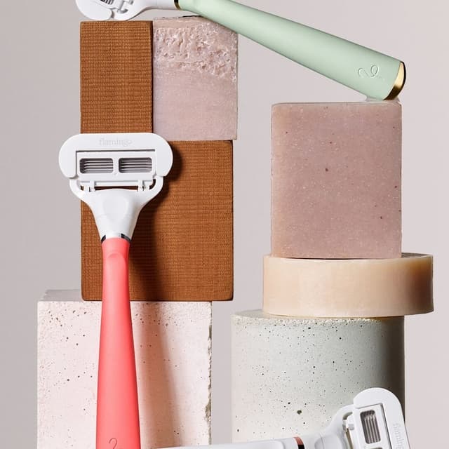
- The case study shows the revised identity on grooming products and razor packaging, where the wordmark and supporting symbol work across different formats.
Keep exploring
Related cases