Logo Modernization for Trixie
Logo engineered to survive rubber labels, die-cuts, and one-centimeter print runs
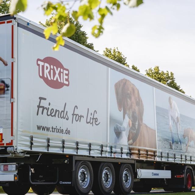
Pet accessories brand Trixie engaged Fontwerk to modernize its logo as part of a full corporate identity overhaul, replacing a dominant 'blue roof' device with a more restrained mark. The new logo had to function across a demanding range of substrates—rubber labels, fabrics, metals, wood—often reproduced at around one centimeter. Fontwerk assembled a team including type and graphic designer Franziska Weitgruber; the brand's target audience was noted as three-quarters female, aged 28–55.
Insights
- Trixie's internal testing revealed the elliptical shape read as unbalanced when the terminal letter was taller than the first, shaping the brief before Fontwerk began.
- All four concepts shared a curved baseline, gradually increasing stroke weight, and a slight upward axis—each attribute mapped to specific brand values such as dynamism, stability, and warmth.
- The brief locked red and white as fixed colors and specified all-capitals, narrowing the design space to letterform refinement within those constraints.
- Designs were presented in real application mockups; the chosen direction was delivered as a vector within an agreed tight timeframe.
1 / 6Swipe
Keep exploring
Related cases