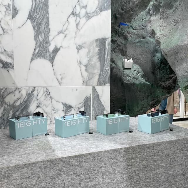
Dinamo developed a Cyrillic extension for their Gravity typeface, a one-weight, twelve-width headline font inspired by 1960s and 1970s grotesks. The update introduces extensive stylistic alternates and variable font capabilities, allowing playful and ultra-condensed typographic compositions across multiple Cyrillic languages.
Set in Gravity
The Brand Identity interviews German type designer Erkin Karamemet about his six-year journey developing Repro, a sans serif typeface released with Swiss foundry Dinamo. Karamemet discusses the technical and conceptual evolution of Repro, including its unique circle function and hybrid geometric-humanist design. The conversation explores his inspirations from signage and digital systems, as well as his ongoing collaborations with Dinamo and other artists.