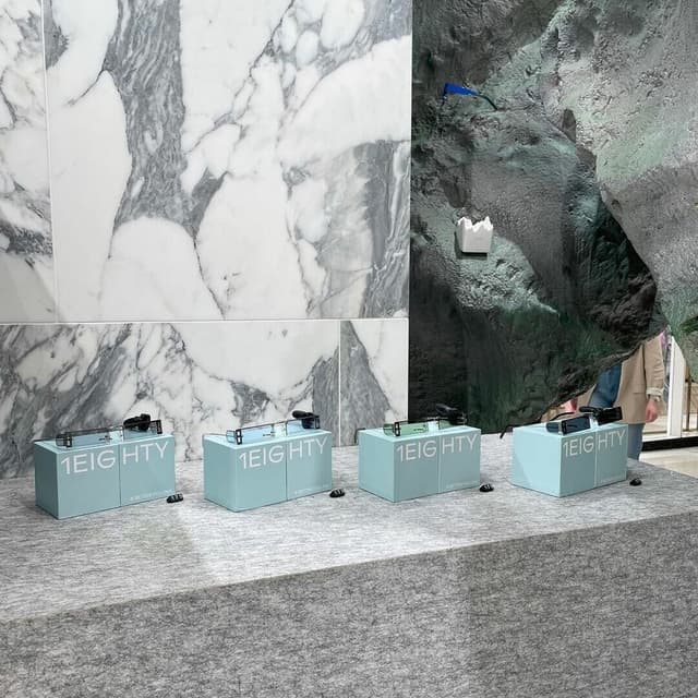
Typeface Design for ABC Favorit
ABC Favorit is a low-contrast grotesque typeface that merges geometric precision with subtle quirks and humor. Designed by Dinamo, it includes multiple weights, italics, and specialized versions such as Favorit Lining and Favorit Mono, along with extensive multilingual support. The typeface balances functional clarity with playful details, making it adaptable across diverse applications.
Set in ABC Favorit
News
- Velvele creates five-value logo system for longevity brand Omnui — the-brandidentity.com
- Redkroft Brands Poland’s First Nitro Coffee With Scientific Identity — the-brandidentity.com
- Javas Lehn Studio’s book for José Parlá showcases characterful yet restrained typographic treatment — the-brandidentity.com
- Koto And The Washington Posts Vibrant Campaign For Well Being Raises Lifes Overwhelming Questions — the-brandidentity.com
- Caserne Work Mac Montreal Brand Exhibition Announce Temporary Closure — the-brandidentity.com
- How Do Running And Raving Come Together Studio Loutsis Had Some Ideas For Running Orders Run2rave — the-brandidentity.com
- Parsons Bold Identity For Hero Aims To Capture The Conversation Between Consumer And Company — the-brandidentity.com
- Dothings Bold Identity For Future Fair Uses Type And Colour To Vibrantly Celebrate Collaboration — the-brandidentity.com
- OMFGCO Transforms Old Singapore School into Creative Hub — the-brandidentity.com
- "Top 50 Fonts Designers Will Love in 2026"