Customized Typeface and Wordmark for Discord
Discord’s tiniest rebrand sparked 182 protest threads.
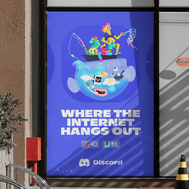
Dinamo created a bespoke wordmark and customized version of the Ginto typeface for Discord, the leading communication platform for gamers. Collaborating with Studio Koto and AKQA, the design balances playful energy with geometric-humanist precision, resulting in a bold yet approachable identity that reflects Discord’s community-driven spirit.
Set in ABC Ginto, Ginto Nord
Insights
- Discord’s 2021 rebrand, timed to its sixth anniversary, was a collaborative effort by Koto, AKQA, the in-house team, and Dinamo, who supplied the logo type: ABC Ginto.
- The changes themselves were deliberately modest — Clyde was only lightly redrawn and the signature blurple shifted to a louder register — yet the community reacted as if the whole brand had been replaced.
- User backlash was intense and specific: moderators counted more than 182 protest threads, #BringBackBlurple was launched by one of Discord’s own UX designers, and complaints focused on eyestrain, Clyde looking like a block of cheese, and the logotype reading as “DiSCOrd.”
- The most revealing thread invited users to suggest a better typeface and drew roughly 800 replies, most of them jokingly proposing Comic Sans—showing how much the audience fixated on typography.
- Redesign controversies at social platforms often center on type and color rather than structure. Dinamo also clarifies that ABC Ginto was only the 2021 logo typeface, while gg sans was a later, separate interface project.
Keep exploring
Related cases