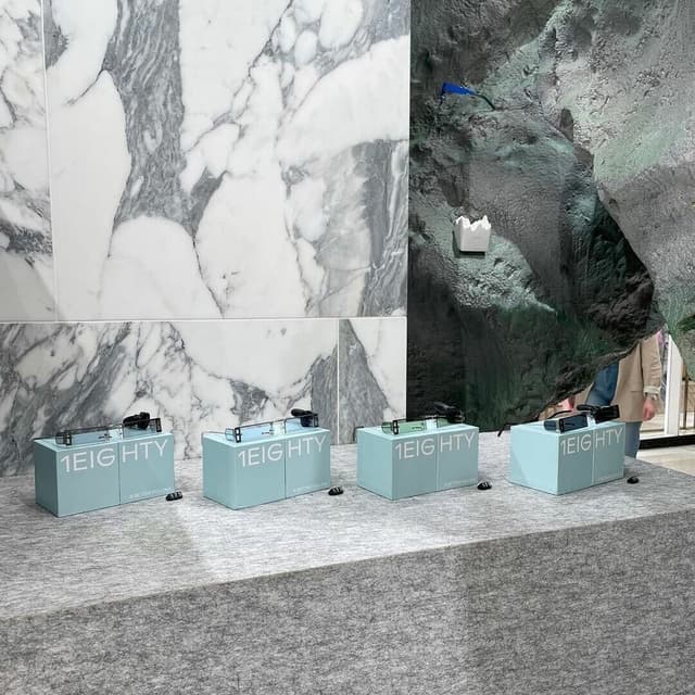
Diatype Rounded is a warm, curvy sans-serif typeface developed by Dinamo. Inspired by Swiss Neo-grotesque forms and pre-digital typesetting machines, it combines mechanical precision with a friendly, pop-infused character. The result is a bold yet approachable type family with subtle humor and versatility across multiple weights and styles.
Set in Diatype Rounded
Keep exploring
The article recaps a Nicer Tuesdays talk where Liz Gorny interviewed Johannes Breyer from Dinamo. They discussed the studio’s playful approach to type design, recent projects like Spotify Mix and Pelikan, and Dinamo’s evolution into a professional yet experimental foundry. The conversation highlighted the studio’s philosophy of treating fonts as creative playgrounds.
The Brand Identity interviews German type designer Erkin Karamemet about his six-year journey developing Repro, a sans serif typeface released with Swiss foundry Dinamo. Karamemet discusses the technical and conceptual evolution of Repro, including its unique circle function and hybrid geometric-humanist design. The conversation explores his inspirations from signage and digital systems, as well as his ongoing collaborations with Dinamo and other artists.


