Global Brand Identity for Brompton
Brompton went corporate—until Blackburn unfolded it back to life.
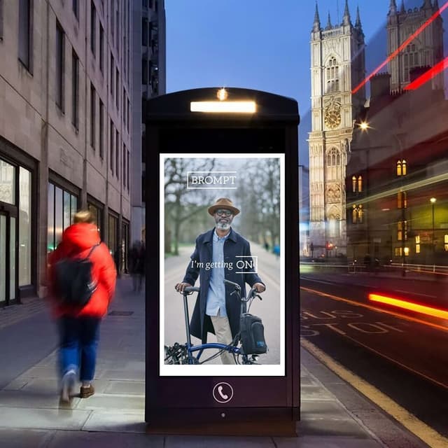
Studio Blackburn transformed Brompton’s fragmented identity into a unified, digital-first global brand system. Built around the "Life Unfolded" platform, the work includes the custom Brompton Slab typeface, motion principles based on the bike’s mechanics, Brompton Blue, and a warm community-led voice.
Set in Brompton Slab
Insights
- Studio Blackburn’s starting point was that Brompton had come to feel corporate and clinical; Studio Blackburn rebuilt it around “Life Unfolded” to unify a brand that now spans retail, online, dealers, CRM, and advertising across global markets.
- The identity is built directly from the bike’s mechanics: the logo system unfolds like the physical fold, motion changes by intensity like two-, six-, and twelve-speed gearing, and the voice shifts from corporate to community under “Welcome to the Fold.”
- Brompton Slab was custom-built from just eight original letters into a full alphabet with global language support and long-form legibility; for launch photography, large metal letters were cut on the factory floor.
- Paul Blackburn framed the work around movement, saying, “Brompton is more than a bike, it's a lifestyle and a community, but at its heart, it's a moving product, so it needed a moving brand.” He also called real riders in real cities Brompton’s “other colour.”
Keep exploring
Related cases