Brand Identity and Strategy for Neko Health
Bedow's Neko Health branding turns proactive care into a shifting logo and a cloud of scanning dots.
Bedow developed a comprehensive brand identity and strategy for Neko Health, a med tech company pioneering proactive healthcare through advanced scanning technology. The design features a dynamic logotype, patterned dot motifs, and a vibrant yet serene color palette that reflects optimism, innovation, and trust in preventative care.
Insights
- Bedow built the strategy around a shift from treating symptoms to detecting risk earlier, distilled into the platform “Ahead of Your Health.”
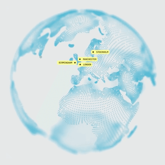
- A dynamic logotype can move to express proactivity, while a cloud of patterned dots makes Neko's proprietary body-scanning process visible.
- The palette combines clinical monochrome shades with warmer optimistic colors; pastel still-life photography by Tommy Olsson adds serenity and a human dimension.
- Bedow also developed a bespoke typeface for digital and physical applications, but the official case does not name it, so it should not appear as a fabricated font-family entry.
Keep exploring
Related cases