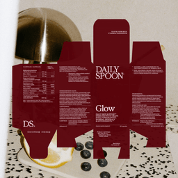
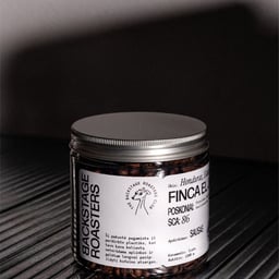
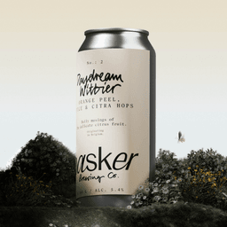
Andstudio is a Vilnius-based branding and digital design agency known for creating purposeful, value-driven design solutions. Led by co-founders Augustinas Paukštė and Domas Mikšys, alongside CEO Diana Abramavičiūtė, the multidisciplinary team bridges strategy, creativity, and technology to build brands that resonate beyond aesthetics. Their expertise spans brand identity, digital design, motion, and packaging, with a focus on clarity, precision, and relevance. Through a collaborative approach, Andstudio transforms ideas into compelling brand experiences that connect meaningfully with audiences across industries.
Works with Noto, Groteska, Epilogue, Žalgiris Sans, Ivar Text, PP Neue Montreal
Their own site is set in Open Sans, Px Grotesk
Designers and creative leads attributed to And in press coverage.
Technologies detected on And's website.
Studio Bland expanded its established identity for Brisbane's The Calile hotel into a flexible system of sub-identities for four recurring cultural-programme strands: Book Club, Swim Sets, Rooftop Harvest and Calile Culture. In collaboration with New Initiative, the studio used a restrained shared visual language, adding Editorial New to the existing type system while deploying photography, motion and a comic short film to create distinct experiences without losing connection to the parent brand.
Creative Boom asks experienced creatives whether it is possible to sustain a fulfilling career into later life in an industry often biased toward youth. Contributors argue that longevity comes from competing on judgment, client understanding, trust and relationships rather than speed or trend awareness, while maintaining curiosity and healthier working practices.
Tinder and agency Jellyfish have launched Dump Traditional Dating, a campaign promoting Tinder's new Double Date feature to Gen Z. Its hero film humorously shifts daters from a rigid Victorian-style first date to a relaxed arcade double date with friends, supported by video-on-demand, radio, social content and the TikTok series Double Date Island.
Studio Bland developed a comprehensive, material-led identity for The Calile, a five-star urban resort in Brisbane, ahead of its 2018 opening. Drawing from Richards & Spence's travertine, concrete and brass architecture, the studio created a durable system spanning collateral, typography, illustration, digital touchpoints and minimally integrated wayfinding. Over eight years, Studio Bland stewarded and adapted the identity as the hotel grew before systems were transferred to its in-house Brisbane team.
Lisa Cain argues that everyday food packaging can gain lasting value when consumers find practical uses for it after its original contents are gone. Using Quality Street tins, Gü ramekins, Bonne Maman jars and Affogato Brand Design's Rude Olive lunchbox concept as examples, the article advocates designing packaging for durability, washability, closure performance and long-term usefulness.
BrandOpus has created the positioning, corporate identity and launch line for Hovis Bakeries, the newly combined business formed after Allied Bakeries acquired Hovis Group. The identity uses an "Elemental Power" concept based on earth, water, air and fire, deliberately avoiding familiar bread-category imagery such as wheat fields, sliced loaves and sunrises.
The Dieline’s June 2026 roundup highlights notable packaging and branding stories, including Pirate’s Booty’s redesign, Moozy’s canned milk, and Coca-Cola’s World Cup collectible cans. The article also mentions collaborations like Fortnum & Mason’s biscuit tin with Design Bridge and broader discussions on AI’s role in design. It serves as a snapshot of the month’s most talked-about creative projects and industry trends.
UnderConsideration’s Brand New briefly spotlights Jus-Rol’s new logo and packaging, designed by Brandon Consultants. The post notes the project as an evolution of the brand’s identity within the UK consumer products sector.
UnderConsideration’s Brand New briefly spotlights a new logo created by SAND for the Association of Applied Paleontological Sciences. The post, categorized under 'Spotted', notes the use of a sans serif typeface and grunge aesthetic, aligning with the advocacy industry context. The article serves as a short announcement rather than a full review.
Brand New announced that due to the typical summer slowdown in the design industry, it will publish fewer posts this week. The site will skip its usual 'Reviewed' category but continue to share smaller updates under 'Noted', 'Spotted', and 'Linked' until the July 4th weekend.
The article by Tom May explores how designers are grappling with a shift from creating original work to refining AI-generated or pre-made content. Through insights from multiple creatives, it discusses the psychological and professional impact of this change and offers strategies for maintaining creativity, such as personal projects and setting client boundaries. The piece emphasizes reclaiming the 'maker' mindset in an increasingly automated design landscape.
The article 'The Best of the Lot' on Brand New, written by Armin, highlights top recent logo and identity redesigns reviewed on the site. It references notable projects such as KFC’s rebrand by JKR and Sam’s Club’s identity by Turner Duckworth. The post serves as a curated roundup of standout branding work featured on Brand New.
UnderConsideration’s Brand New briefly notes the new logo and identity for Prosper Global, designed by Chermayeff & Geismar & Haviv. The project introduces a turquoise, sans serif identity featuring an arrow and heart icon, signaling a modern and optimistic tone for the non-profit organization.
Brand New, the design review platform by UnderConsideration, announced a new feature titled “Brain-freeze not Included.” The short post, authored by Armin, introduces the feature as part of the site’s ongoing editorial updates. The article serves as a brief news item rather than an in-depth project review.
The article profiles Madrid-based designer David Heofs and his studio Bandiz, which creates tactile, analogue-inspired visual identities for musicians. Using materials like crayons, ink, and collage, Heofs blends physical craft with digital typography to produce expressive, textural designs for clients such as Sony Music and Universal Music. The piece highlights his process-driven approach and the distinctive handmade quality of his work.
Mexican studio Brands&People refreshed the identity of Moctezuma, a cement and concrete brand, drawing inspiration from Mesoamerican architecture and glyphs. The new system extends across packaging, vehicles, digital platforms, buildings, and merchandise, bringing cultural pride into an industrial category.
The article on Brand New, a division of UnderConsideration, announces a new post titled “Playing on the Razor’s Edge.” Published by Armin on June 18, 2026, it appears as a brief linked news item with limited content available to subscribers. No project details or design analysis are visible in the public excerpt.
The article explores the realities faced by independent agency founders in their first year, highlighting the emotional, financial, and structural challenges of leaving established agencies to start small studios. Through interviews with founders across the UK, it reveals a shift toward smaller, more agile creative teams responding to changing client expectations and tighter budgets. The piece positions 2026 as a pivotal year for indie studios redefining the creative industry landscape.