← Back to Fonts
Wulkan Display — 1 case
Used by Buck
Set for Sense
Cases set in Wulkan Display, as credited by the studios in their own writeups.
Wulkan Display in the news
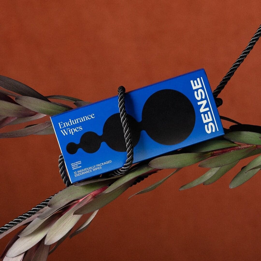
- Logo & Branding for Sense by Buck
BP&O · Sep 5, 2024
BP&O features Buck’s brand identity for Venezuelan sexual wellness startup Sense, created ahead of its North American launch. The design emphasizes playfulness and confidence through bold typography, organic shapes, and a vibrant seven-color palette. The packaging and identity aim to destigmatize sexual wellness products by presenting them with openness and aesthetic appeal.
- UnitedUs Blends Art Deco Style With Cocoa Runners’ Craft Chocolate Brand
The Brand Identity · Nov 29, 2023
Brighton-based agency UnitedUs created a new Art Deco-inspired identity for craft-chocolate retailer Cocoa Runners as the company marked its tenth anniversary. The work combines an opulent yet functional typographic system, a warm neutral palette, evolving illustration assets, and an improved e-commerce site with AI-generated search.
UnitedUsThe Designers FoundryCocoa Runnersbranding - How&How Campaign Highlights Seaweed Forest Loss and Restoration Needs
The Brand Identity · Jun 8, 2021
How&How’s 'Forgotten Forests' campaign, part of their BeHalf series, raises awareness of seaweed forest reduction in collaboration with the charity SeaForester. The campaign uses delicate, ethereal photography and animated typography to evoke underwater calm and highlight the importance of ocean restoration. The visual identity employs Wulkan Display typeface and a tranquil color palette to reinforce the environmental message.
- Jacob Lindblad’s identity for Guéri Skin Science is equal parts pragmatic and cosmopolitan
The Brand Identity · Apr 14, 2021
Berlin-based designer Jacob Lindblad created a pragmatic yet cosmopolitan identity for Danish skincare brand Guéri Skin Science, working with copywriter and brand consultant Peter Strandby. Drawing on 1950s beauty packaging, the identity uses Wulkan Display and Basier Circle across monochrome, semi-clinical packaging for the brand's dermatological and cosmetic products.
Jacob LindbladAtipo FoundryGuéri Skin Sciencebranding - COLLINS’ relaxing rebrand of dating site Match takes tonal inspiration from real-world ambience
The Brand Identity · Feb 17, 2021
COLLINS rebranded the online dating platform Match with a sophisticated and calming identity inspired by real-world ambience. The new design features custom typography, gentle gradients, and a tonal palette that evokes warmth and intimacy. The project aims to position Match as a mature and welcoming alternative within the dating app landscape.
- Five New Design Projects, Including Husmee’s KUNSTHAL Identity
The Brand Identity · May 21, 2020
This edition of The Edit highlights five identity projects by Husmee, Simple, Studio Alba, Tim Semple Studio and Ricardo d'Avila. Featured work includes Husmee's colourful modular redesign for Bilbao design school KUNSTHAL, Simple's landmark-led Rundle Mall rebrand, and typographic identities for Reconome, Lost Motel and LTDO.