← Back to Fonts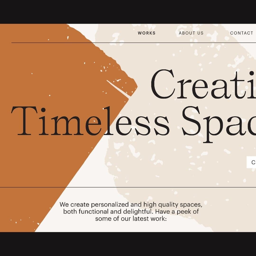
Self Modern — 1 case
Used by Classmate
Set for Qvarta Architects
Cases set in Self Modern, as credited by the studios in their own writeups.
Self Modern in the news
- "View Source Revamps Moonbeam Blockchain with Ethereal Identity"
The Brand Identity · May 13, 2025
View Source developed a new brand identity and UI for blockchain platform Moonbeam, embracing an ethereal concept inspired by 'moonlit photosynthesis.' The project combines AI-generated imagery, 3D animation by Studio Gamma, and a refined typographic system to create a distinctive, atmospheric digital experience. The rebrand moves away from typical web3 aesthetics, positioning Moonbeam as a mature and innovative platform.
View SourceStudio GammaOB StudioMoonbeambranding - SOMETHING ELSE’s Lauren Gallagher on embracing the new and adapting to life’s unexpected hurdles
The Brand Identity · Aug 12, 2022 · Interview
The Brand Identity interviews Chicago-based designer Lauren Gallagher, founder of SOMETHING ELSE, about launching her studio just before the pandemic, adapting to change, and the value of co-working environments. Gallagher reflects on her career path, lessons from working at Cards Against Humanity, and her evolving approach to creativity and independence.
SOMETHING ELSECards Against HumanityQuiet EnjoymentCards Against Humanitybranding - Play’s identity for Refactor Capital reflects the radical investment firm’s compassionate calling
The Brand Identity · Mar 25, 2022
San Francisco-based studio Play created a new brand identity for Californian investment firm Refactor Capital, reflecting its mission to reform traditional finance through sustainability and compassion. The identity combines a customised Fellix sans with Self Modern serif, geometric circular motifs, and an earthy 'Refactor Red' palette. The result is a warm, approachable system that balances trust and innovation.
- Studio Ghazaal Vojdani and Julia Novitch’s identity for the BSA celebrates the society’s variety, tactility and materiality
The Brand Identity · Dec 9, 2020
Studio Ghazaal Vojdani and Julia Novitch created a tactile, print-first identity for the Bibliographical Society of America, emphasizing materiality and the physicality of text. The rebrand uses Bretagne’s Self Modern typeface and a circular logotype to bridge the society’s scholarly heritage with a contemporary digital presence. The identity extends across print and digital applications, reflecting the BSA’s mission to celebrate the material text.
Studio Ghazaal VojdaniBibliographical Society of America (BSA)branding - Studio Last Reinvents Interview Germany With Playful, Punk-Inspired Redesign
The Brand Identity · Nov 17, 2020
Berlin-based Studio Last created a one-off redesign for Interview Magazine Germany’s October 2020 JDG issue, starring Jack Dylan Grazer and featuring an interview by Finn Wolfhard. The studio overhauled the logo, typography, layout and art direction with a punky, futuristic visual system that connected the downloadable magazine format with physical editorial design. The issue uses a 3D logo and contrasting grotesque and semi-gothic serif typefaces to address gender fluidity, diversity, fan culture and subculture.
- Never Now produces an elegant typographic identity for small-batch Australian whisky Hillwood
The Brand Identity · Jun 26, 2020
Melbourne studio Never Now created a refined typographic identity and packaging for Hillwood, a small-batch Tasmanian whisky. The design features a custom serif wordmark, embossed monogram, and minimalist materials that reflect the purity and craftsmanship of the distillation process. The project emphasizes elegance, restraint, and a connection to the brand’s family heritage.
Never NowBretagneDH-Z PhotographyHillwoodTamar Valley Distillerybranding