← Back to Fonts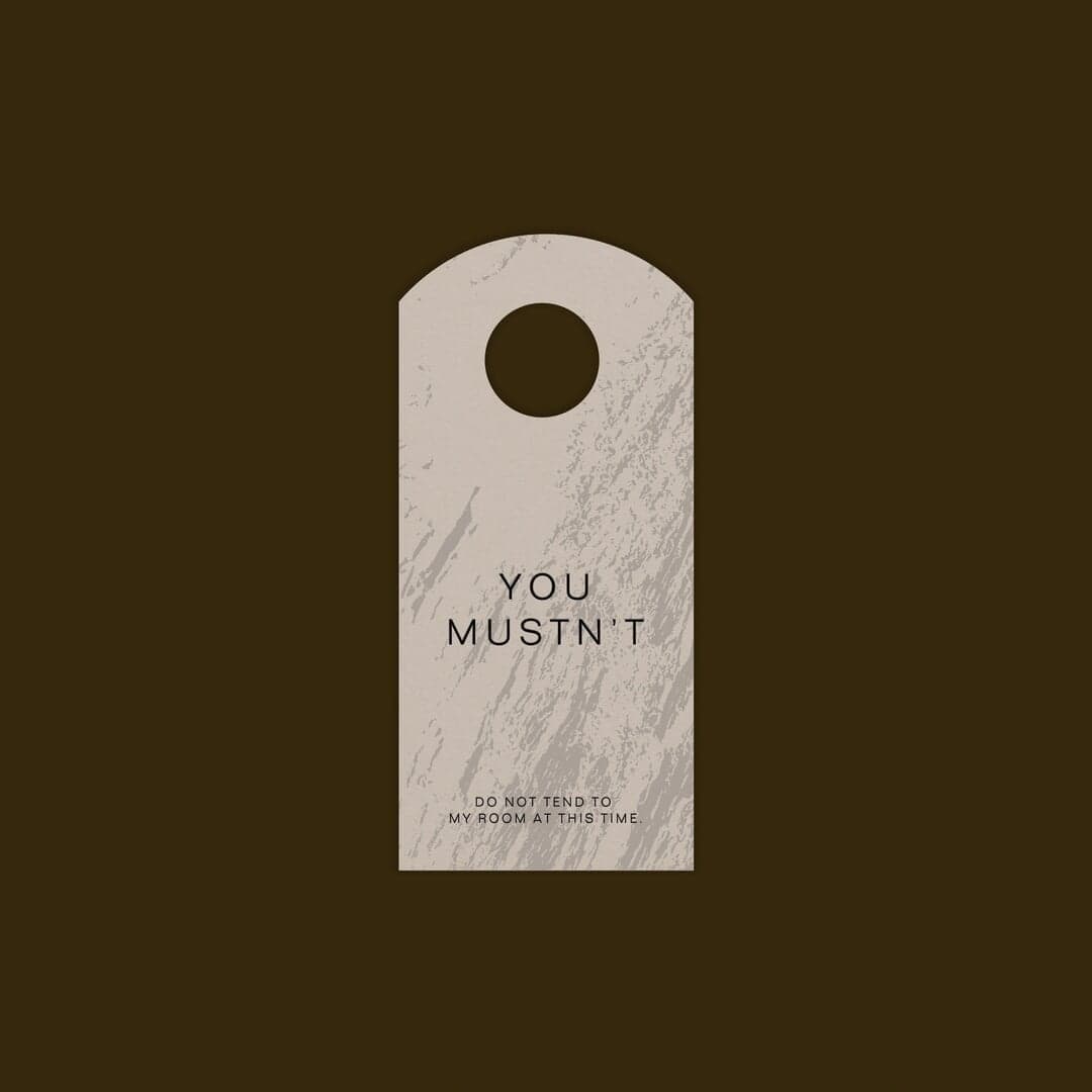
Folio — 1 case
Used by Mother Design
Set for Park Lane Hotel
Cases set in Folio, as credited by the studios in their own writeups.
Folio in the news
- Site Takes Short End-of-Summer Break, Returns September 8
The Brand Identity · Aug 21, 2026
Mouthwash Studio rebranded Los Angeles eyewear label Bonnie Clyde with a Shakespearean identity built around love, fantasy, self-expression and the brand's existing exploding-heart symbol. The studio developed strategy, a bespoke Lombardic-inspired wordmark, a mythology of illustrated symbols, digital and motion work, and a website, supported by extensive research into medieval manuscripts, churches and historic lettering. The final identity uses a restrained neutral palette with romantic named accent colours to foreground eyewear, photography and storytelling.
- Mouthwash Rebrands Bonnie Clyde Eyewear With Romantic New Identity
The Brand Identity · Aug 21, 2026
Dallas-based ModestWorks and San Francisco-based Moniker created Atlético Dallas’s identity ahead of the club joining the USL Championship in 2027. Built around a fabricated but place-rooted myth of the Mexican Grey Wolf and rattlesnake, the system features a hand-painted heraldic crest, historic serif and sans typography, custom blackletter numerals, and a Texas-derived palette.
- This collaged architect’s identity from Alexis Mark drew from departure boards and timetables
It's Nice That · Apr 13, 2026
Copenhagen-based design studio Alexis Mark created a new brand identity and website for architecture firm Cobe. Drawing inspiration from departure boards and timetables, the identity uses collage and utilitarian design to reflect Cobe’s sustainable, reuse-oriented ethos. A custom typeface, AM Kosmos, anchors the system, blending industrial precision with expressive form.
Alexis MarkCobeCobebranding - The Designers: Bleed’s Halvor Nordrum on design as a career, smart software tools and life in Oslo
The Brand Identity · Aug 5, 2022 · Interview
The Brand Identity interviews Bleed designer Halvor Nordrum about his career path, creative process, and life in Oslo. He discusses his journey from student to professional, his rewarding work on Historisk museum’s identity, and his interest in developing smarter design systems and tools. Nordrum also shares his favorite typefaces, colors, and thoughts on balancing work and life.
- Mother Design’s eccentric identity for Park Lane hotel sets the standard for NYC’s uptown luxury
The Brand Identity · Jan 24, 2022
Mother Design created a new brand identity for New York’s Park Lane Hotel, reimagining its uptown luxury through an eccentric and organic visual system inspired by Central Park and the building’s architecture. The project features a custom wordmark, seasonal color palettes, and the use of Folio typeface to balance whimsy with modernist sophistication.
- Bildung and Bureau Antoine Roux’s mindful interview site Developments is insightful and delicate
The Brand Identity · May 20, 2021
The article highlights the collaborative creation of the mindful interview website Developments by Bildung and Bureau Antoine Roux. The project emphasizes a slow, editorial approach to digital design, using the Folio typeface and a minimalist aesthetic to create a calm and engaging reading experience. Developer Tristan Bagot contributed to the web development, resulting in a refined and thoughtful platform for creative interviews.
BildungBureau Antoine RouxDevelopmentsdigital