Sessions
Design work for Sessions, collected from the studios behind it.
- Design cases
- 2
- Studios
- 2
- Latest work added
- Feb 2025
- Brand Identity 1
- Packaging 1
Design cases by studio
OMSE (1)
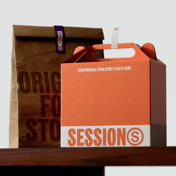
- Brand Identity for Sessions Food Platform
- OMSE developed a distinctive identity for Sessions, a UK-based growth platform for food brands, to reflect their strategy of 'Non-Stop Originality.' The new branding centers around an 'S' symbol inspired by trademarks, supported by bold typography, vibrant colors, and fresh photography to position Sessions as curators of original food stories. The identity extends to their physical space, Shelter Hall, maintaining a cohesive yet unique visual language.
White Bear (1)
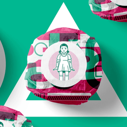
- Packaging Design for Sessions X Squid Games Collaboration
- White Bear Studio collaborated with Sessions to design packaging for their partnership with Netflix, inspired by the hit series Squid Games. The packaging suite captures the bold, playful energy of the show while complementing the Korean fried chicken menu created for the collaboration.
Designers behind the work
Designers and creative leads credited on Sessions projects in press coverage.