Mimacom
Design work for Mimacom, collected from the studios behind it.
- Design case
- 1
- Studio
- 1
- Latest work added
- Nov 2024
- Brand Identity 1
Design cases by studio
Mirage (1)
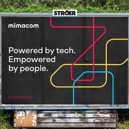
- Brand Identity and Website for Swiss Software Company Mimacom
- Mirage reimagined Mimacom’s brand from strategy to design, creating a cohesive identity that bridges people and technology. The new visual system emphasizes continuous flow, collaboration, and adaptability through a custom logotype and a vibrant, interconnected color palette.
Designers behind the work
Designers and creative leads credited on Mimacom projects in press coverage.