Market Art Fair
Design work for Market Art Fair, collected from the studios behind it.
- Design cases
- 2
- Studios
- 2
- Latest work added
- Aug 2025
- Brand Identity 2
Design cases by studio
25AH (1)
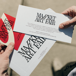
- Visual Identity for Market Art Fair
- 25AH developed a refined and flexible visual identity for Market Art Fair, the leading Nordic marketplace for contemporary art. The design features a bespoke serif wordmark with a distinctive tilted 'R', a monochrome base palette refreshed annually with curated accent colors, and a dynamic pattern derived from the logo. This evolving identity balances elegance and creativity while maintaining relevance across years and platforms.
SDL (1)
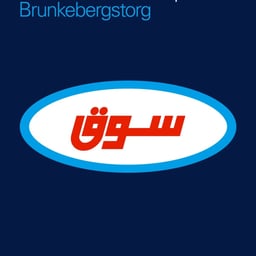
- Brand Identity for Market Art Fair
- Stockholm Design Lab developed a bold new identity for Market Art Fair, Stockholm’s leading Nordic art event. Drawing from the visual language of classic FMCG brands and pop art, the design bridges the artistic and commercial worlds, signaling both marketplace energy and cultural sophistication.
Designers behind the work
Designers and creative leads credited on Market Art Fair projects in press coverage.