Lyft
Design work for Lyft, collected from the studios behind it.
- Design cases
- 2
- Studios
- 2
- Latest work added
- Oct 2026
- Brand Identity 1
- Typography 1
Design cases by studio
NaN (1)
- Lyft — Custom Typeface
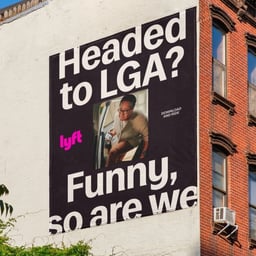
- NaN developed a custom typeface family for Lyft with Koto in 2025. The sans serif combines moderate contrast with angular terminals and asymmetrically flared strokes. Three styles divide its responsibilities: Logo supports sub-brands, Display serves the visual identity, and Text handles small sizes and body copy. Each is available from Regular to Bold and in Roman and Italic. The Logo design carries over the geometric f and t from Lyft’s original logo, keeping a connection to the existing brand. Text retains dynamic details from Display, including the terminals of a, d and q, while using a distinctive l for legibility. The family was designed to work across applications ranging from app screens to outdoor advertising.
Koto (1)
- Brand Identity Refresh for Lyft
- Koto partnered with Lyft to evolve its brand identity for the next chapter of ridesharing. The refreshed system balances confidence with humanity, refining the logo, color palette, and visual language to feel more mature while keeping Lyft’s joyful, people-first spirit intact. The result is a cohesive identity that scales across all touchpoints and reinforces Lyft’s position as the human face of mobility.