Hyundai Card
Design work for Hyundai Card, collected from the studios behind it.
- Design cases
- 4
- Studios
- 4
- Latest work added
- Oct 2026
- Brand Identity 4
Design cases by studio
Wolff Olins (1)
- Brand Identity for Hyundai Card
- Wolff Olins developed a design ethos and identity system for Hyundai Card, connecting its financial products with a wider programme of cultural spaces and experiences. Research in Seoul included time with employees and customers, interviews with young Koreans and a city tour led by a local historian. The resulting idea, Architect of Change, describes the company’s role in creating new possibilities for people to choose from. The design system balances a fixed core, including logo placement and typography, with flexible elements that give individual cards their own character. For the M, X and Z entry cards, bright colour and generative repetition connect the visual language to repeat rewards. Modular packaging unifies the range, using a protective layer that peels away to reveal each card. Initially conceived as an internal ethos, Architect of Change also appeared on the packaging.
SMLXL (1)
- Credit Card Design for Hyundai Card
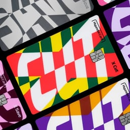
- SMLXL created a unified visual identity for Hyundai Card’s new X-Cut and X-Save credit cards, targeting different age groups with distinct yet connected aesthetics. The design emphasizes the intersecting 'X' motif, premium metal materials, and adaptable layouts for both physical and digital use.
Made Thought (1)
- Brand Creation and Campaigns for Hyundai Card
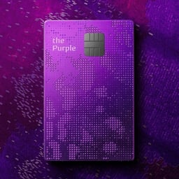
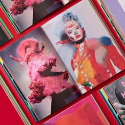
- Made Thought reimagined Hyundai Card’s premium tier offerings by merging brand, experience, and design into a cohesive creative world. Through bespoke journals and curated cultural content, each card—The Black, The Red, and The Purple—was transformed into a storytelling experience reflecting the lifestyle and aspirations of its users.
Ordinary People (1)
- Graphic Identity for Hyundai Card Cultural Libraries
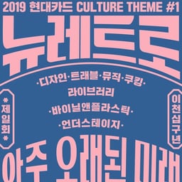
- Ordinary People created the New Retro graphic identity for Hyundai Card’s Design, Music, Cooking, Travel, and Vinyl & Plastic libraries. Drawing on 1970s and 1980s advertising and signage, the system uses bold arched lettering, vertical text, and fan-shaped line structures across window graphics, signage, posters, banners, leaflets, and tickets.