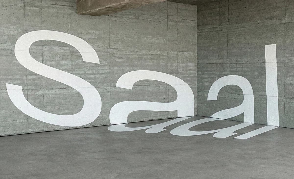
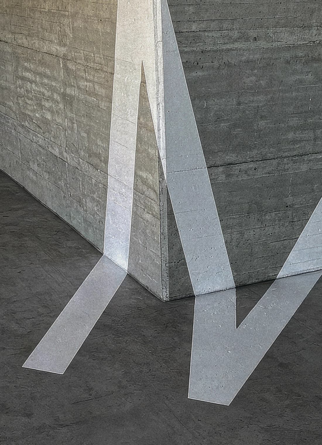
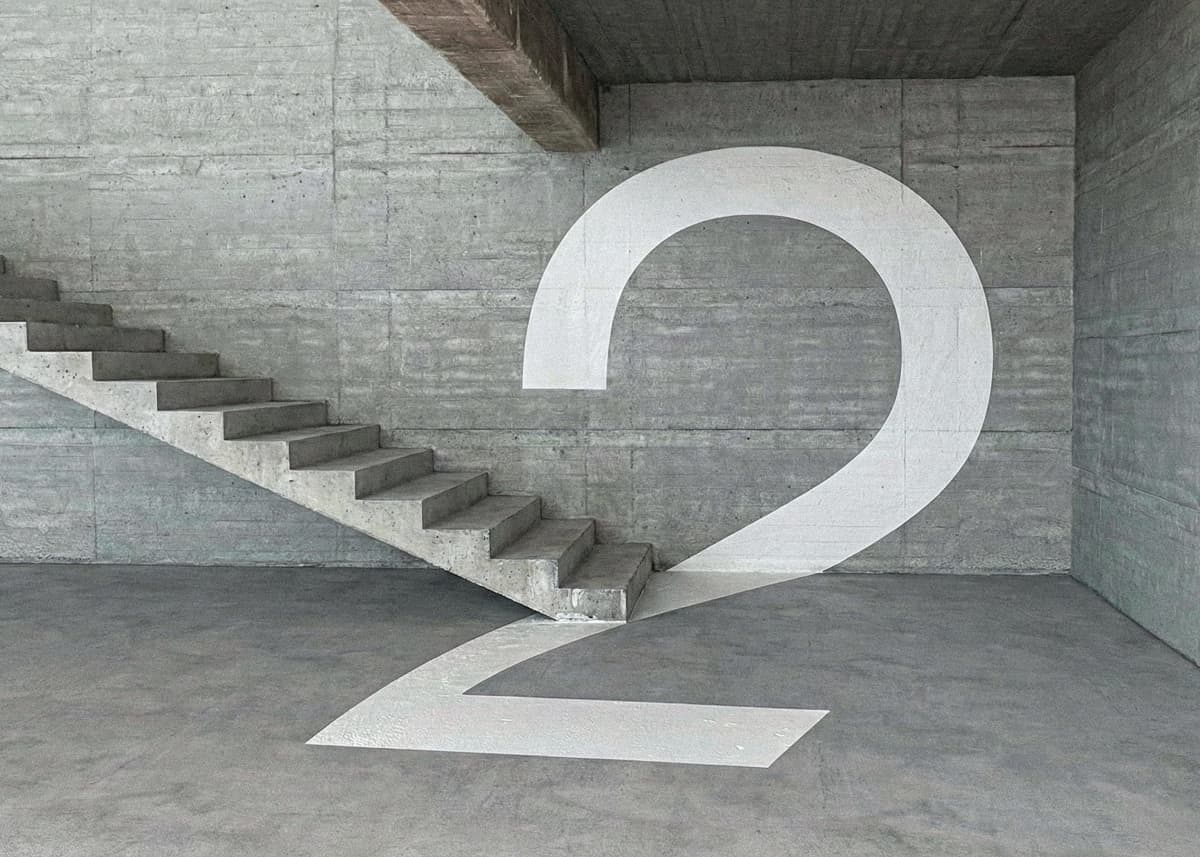
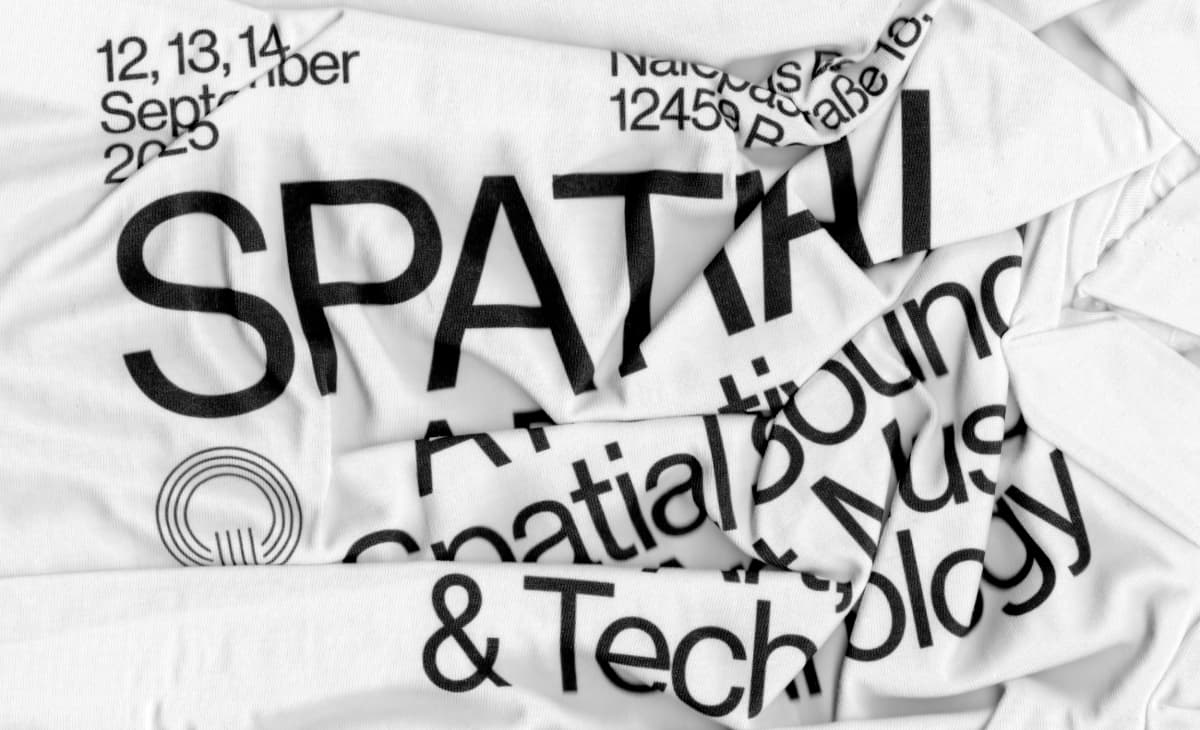
A word stretches across a wall, slips around a corner and changes shape as the viewpoint moves. For Spatial Festival, that movement carries the identity. You recognise the project through the way its graphics occupy space.
Created by SMLXL and Mallandrich for Spatial Festival's 2025 edition, the work has collected recognition across D&AD, ADC, the Type Directors Club and ADG Laus in 2026, including Best of Discipline at both ADC and TDC. The project gives spatial sound a visual counterpart: typography that unfolds as the viewpoint changes. ADC results, TDC results.
A festival experienced through movement
The festival programme brought more than 60 artists to Funkhaus Berlin, a former radio broadcasting complex, with performances and listening sessions created for 4DSOUND. The 2025 edition expanded across five rooms. In the ADG Laus identity entry, the team describes a brief to scale the festival's image with that expanded presence. Monom Studios is the credited client.
The brief poses a specific problem: how do you advertise an experience whose defining quality is being inside it? Spatial's graphics offer a rehearsal. The eye moves around an image, discovering how position changes what can be read. Before anyone arrives at Funkhaus, the campaign introduces movement as part of listening.
Motion entered the process at the beginning
In Harry Bennett's 18 March 2026 feature for It's Nice That, SMLXL partner Anna Berbiela explains that movement informed the identity from the start. The studio and Gerard Mallandrich developed the work together.
The team initially explored scans of Funkhaus, then moved towards constructed virtual environments when the real rooms proved visually too busy. Berbiela also points to cinematic perspective, including the receding titles of Star Wars. Neue Haas Grotesk supplies the deliberately restrained typography, leaving viewpoint and movement to give it character.
That decision gave the team control over the image's depth and density. Some distortions were unplanned: the Laus production notes describe testing camera angles and keeping unexpected results that worked. The rules left room for accidents.
Perspective becomes a design rule
The TDC identity submission describes distortion as a variable the designers could control. Letterforms change scale and depth within the composition, while different environments retain a common visual logic.
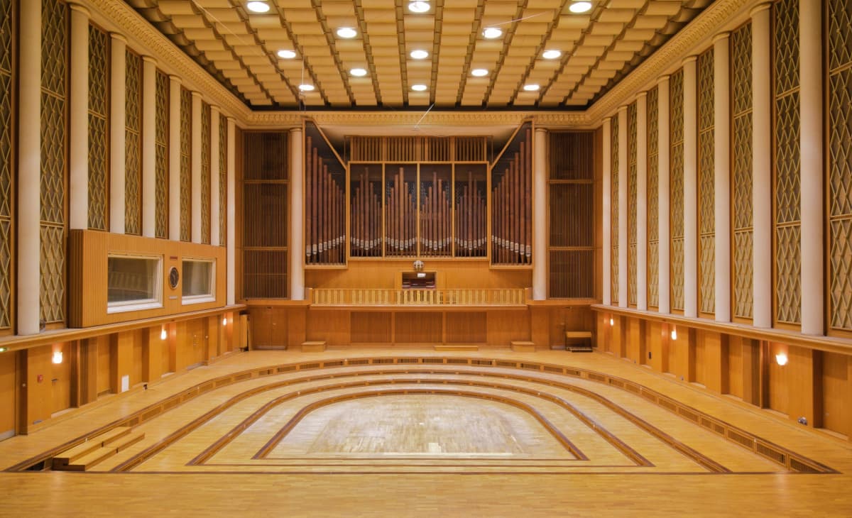
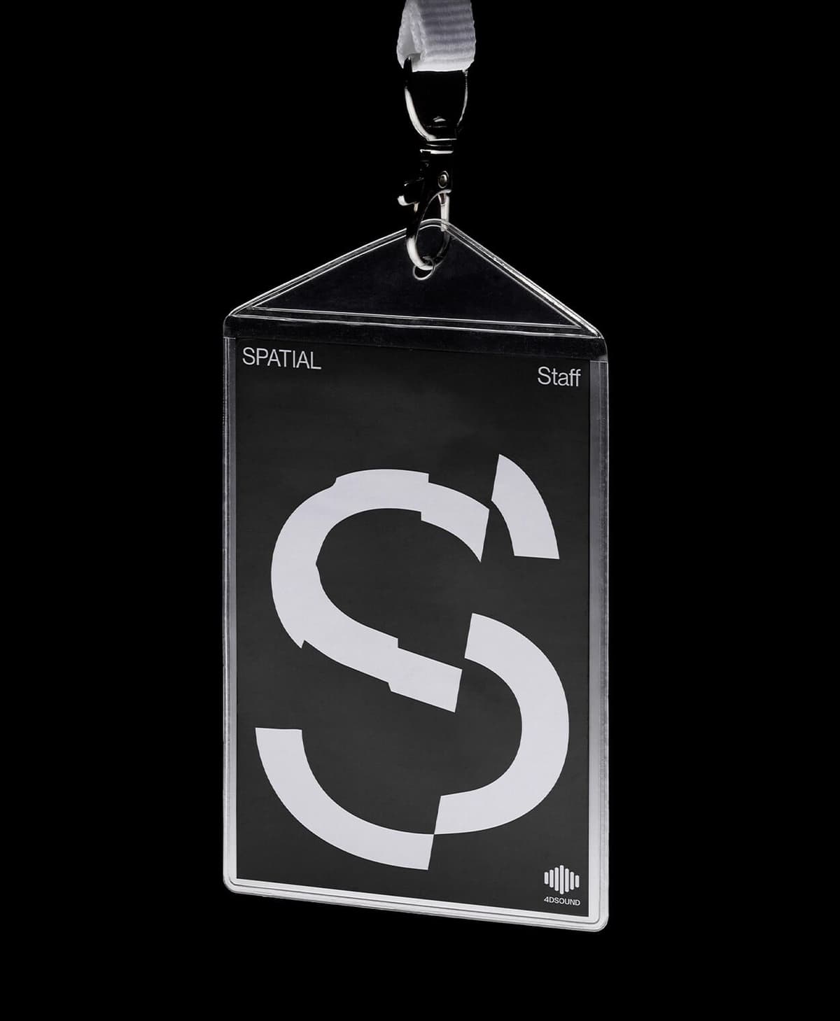
In the opening Saal image, the wall, corner and floor divide the word, yet the typography makes those surfaces read as one composition. On the staff pass below, a fragmented S achieves a related effect on a small, flat object. The two pieces share a way of constructing an image even though they have very different jobs.
The practical test is legibility. An announcement must disclose a date, a pass identify its wearer and a programme help someone decide where to go. The campaign film visibly resolves into a straightforward festival title. That moment of clarity gives the preceding distortion a purpose.
A system the festival could keep using
The social-media entry at TDC describes an identity designed for artist announcements, the manifesto, venue presentations and practical information. Different scenes supply variety while retaining a shared approach to space and movement.
The One Club identity entry records the handover of master files to the festival's internal team. That let the organisers produce further communications within the system as the programme developed.
Program’s development case study explains how the website carried that logic into the browser. Custom shaders project images selected in the CMS onto the designers’ 3D geometry, producing an editable, interactive scene. Organisers could change the imagery while retaining its spatial behaviour. The Laus website submission credits SMLXL, Mallandrich and Program together.

What the critics saw
It's Nice That focuses on the collaboration: Bennett connects the identity's energy to the decision to involve motion design from the outset. Berbiela's account of the process gives that reading substance.
Abduzeedo's review, also published on 18 March 2026, emphasises how closely the graphics embody the festival experience. It draws on the same It's Nice That interview, so the two features share a source for the designers' comments.
For us, the staff pass is a revealing test. Its fragmented S retains the character of the moving work even when the camera stops. The campaign has produced a usable graphic language as well as a compelling film.
The 2026 awards
Twelve category wins across four programmes, plus two Best of Discipline honours. Awards for the 2025 edition, checked in October 2026.
D&AD
2 Graphite · 2 Wood
- Graphite: identity and kinetic typography
- Wood: motion and websites
- View the four Pencils ↗
ADC
2 Gold · Best of Discipline
- Gold: digital and integrated identities
- Best of Brand / Communication Design
- View ADC results ↗
TDC
Gold · 2 Silver · Best of Discipline
- Gold: animated posters ↗
- Silver: social media and identity
- Best of Communication Design ↗
- Judges’ Choice: identity system
ADG Laus
2 Gold · Silver · InBook
Who made Spatial 2025
The SMLXL project credits name the following team:
- Studios: SMLXL + Mallandrich.
- Creative direction: Anna Berbiela, Javier Arizu, Guillem Casasús and Gerard Mallandrich.
- Graphic design: Anna Berbiela, Javier Arizu and Lakis Sobyra.
- Motion design: Gerard Mallandrich, Andrea Pascual, Jorge Rivera and Lakis Sobyra.
- 3D environment design: Gerard Mallandrich, Andrea Pascual and Jorge Rivera.
- Website development: Program.
- Project management: Mireia Quincoces and Clàudia Laporte.
- Case-study photography: Steve Balboni.