The most interesting design briefs are rarely the glamorous ones. They're the ones where nobody was supposed to look. The property management system running a hotel check-in. The notification panel under a YouTube dashboard. The payroll platform onboarding a new hire. The lens you're wearing right now. This week's seven cases are all, in some form, about studios getting hired to redesign the parts of the world that users never look at directly — and making a strong argument that those surfaces are exactly where the best brand work lives now.
One case cuts against the grain: a contemporary art museum in Barcelona that gets a system designed to be less expressive than most of its exhibitions. We'll get to why that's a problem.
Koto Rebrands the System You Use Every Time You Check Into a Hotel
You probably haven't heard of Mews. You've almost certainly used it. Mews is a hospitality management platform — a PMS, in industry shorthand — and it's the invisible piece of software running bookings, check-ins, guest communications, and operations for a large chunk of modern hotels. Everywhere, essential, and normally out of sight.
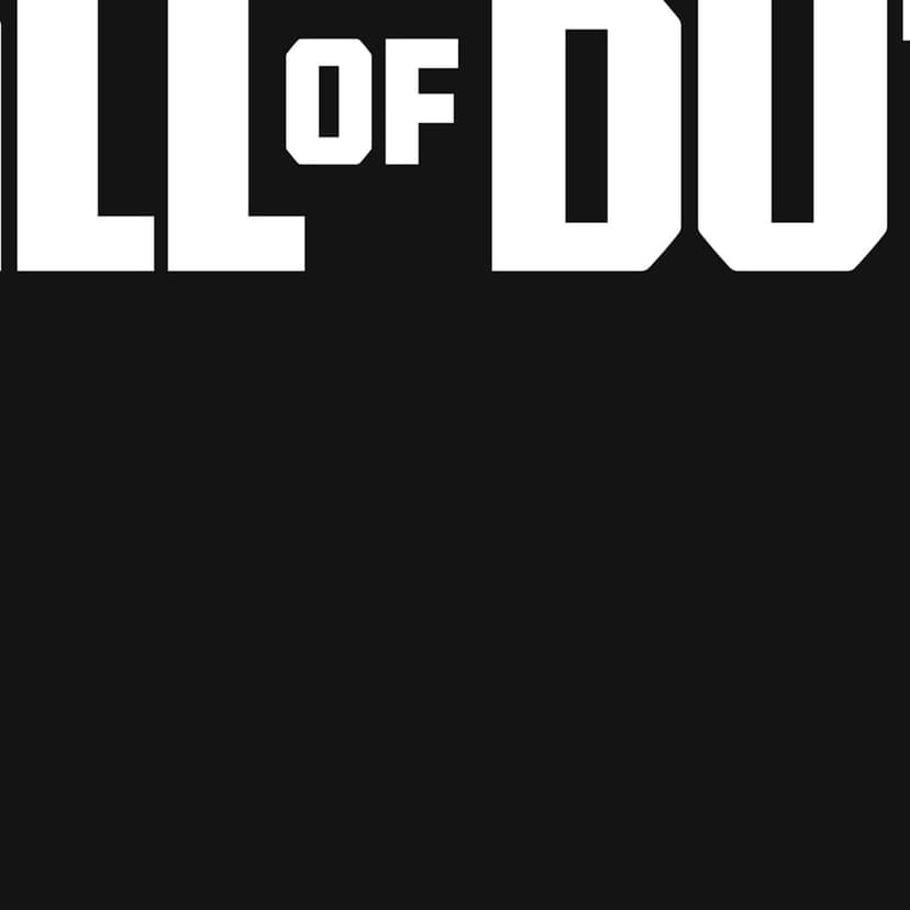
Koto — whose work on Call of Duty, Microsoft Copilot+PC, and Amazon has turned up in these roundups before — got the brief to refresh the identity as Mews grows into its role as a category leader. The result is a three-part system: a funnel-like icon, a monogram M built out of circular forms, and a heavy motion/animation language tying it all together.
The M is doing a lot of work. It reads as a monogram, but it also reads as a signal — a funnel, a flow, one state transitioning into another. That's a fair match for what a PMS actually does: move a guest through arrival, stay, departure, billing. There's a passing resemblance to M&M's European radio identity (cheerful circles forming an M) and to Medium's old wordmark, but the motion language pulls it somewhere else entirely.
The motion library is probably the most under-appreciated part of this project. B2B platforms that invest in a full motion system are still rare — most settle for a static logo and a couple of GIFs. Mews built out something closer to a broadcast identity. You don't see most of it on the current site, but it's the kind of investment that pays off once the product team actually wires it up.
The main competitor here is Oracle's Opera, which still carries the visual DNA of an MS-DOS application. Mews has been voted Best PMS three years running. Design is not the only reason, but it is increasingly part of the reason.
What this case makes clear: hospitality software is no longer a design-agnostic category. The studios that take B2B seriously — Koto, Instrument, Ueno when it was alive — are picking up the most interesting briefs because those clients have budget, operational scale, and a direct line from identity to product.
Mucho Reopens MACBA at 30 — and the System Feels Smaller Than the Museum
Mucho is a Barcelona studio with a strong track record in arts and culture — 207 brand identity projects in their portfolio, 72 of them arts and culture. So the brief to rebrand MACBA (Museu d'Art Contemporani de Barcelona) for its 30th anniversary and upcoming expansion is, in theory, exactly the project they should ace.
The concept Mucho describes is solid on paper: an identity built around openness, breaking the logo out of its traditional "black box," letting MACBA split into MAC and BA to play with images, text, and new meanings. A modular grid. A restrained black-and-white palette. ABC Diatype as the core typeface, with the system shifting from white-space-heavy layouts to more immersive, typography-led compositions depending on the show.
The execution is where the project runs into trouble. What you see across the applications is a category-default cultural institution look — Helvetica-adjacent typography, small images, a lot of white space — that many dozens of museums have already used to identify themselves. The grid is present in the production files, but in the actual compositions it's often ignored (images drift past the outer margin, image placement looks closer to instinct than to system). ABC Diatype is a very good typeface, but at this point it reads as web/tech-era; seeing it on printed museum signage feels slightly out of place — and, more importantly, no longer distinctive.
The brand identifies the museum as a contemporary art museum. It doesn't identify it as this contemporary art museum. For an institution that explicitly rejects a single hegemonic narrative, that's a gap.
There's a larger question here about the default aesthetic of contemporary cultural institutions. MACBA's own vision emphasises rejecting a single dominant narrative and using art to trigger social transformation. That's not a neutral, modular, white-space brief. It's a distinct editorial position — and a distinct editorial position rarely survives a system that aims first for flexibility and second for voice.
To be fair: Mucho's case film and rollout materials are well crafted, and the underlying concept has integrity. But the work reads as competent rather than surprising. For a 30th anniversary, that might not be enough.
Base Design Sells Birkenstocks for 7am and 7pm
Base Design's campaign for Birkenstock's new Utti model is one of those rare moments where the concept is a single sentence and the craft makes it inevitable. The comfort brand that most people associate with summer, pool decks, and the Arizona silhouette has been pushing into closed-toe, full-wear territory for a few seasons now — and the Utti is the flagship. Base Design's job was to convince people that Birkenstocks aren't just a sandal category.
The creative device: pairs. 7am vs. 7pm. Weekend vs. weekday. The Utti on one foot, the Arizona or Boston on the other — worn simultaneously.
"Two shoes. One attitude. The campaign plays with contrast as a form of continuity, pairing Utti with Birkenstock's icons, Arizona and Boston, worn simultaneously on opposing feet. A quiet twist that tells a bigger story." — Base Design
It's a quiet piece of thinking that does more than any number of product-hero shots could. The Utti isn't replacing the Arizona. It's extending what Birkenstock means. You're not choosing between identities; you're adding one.
Worth noting in the wider context of Birkenstock's marketing: the brand's recent 1774 collaborations — subversive partnerships with the likes of Rick Owens and Dior — have taken a similar tonal approach, happy to break brand respectability without losing the comfort core. A decade ago Birkenstock was synonymous with orthopedics. Today, through curated collaborations and sharp campaigns, it's one of the more interesting brands running in fashion.
illo Makes YouTube Studio's Backstage Feel Like a Broadcast
Every YouTube creator with a partner account sees them. The little motion panels. "Your channel just hit 1,000 subscribers." "Your video crossed 100K views." Most of us scroll past without thinking about who made them. illo, a Rome-based studio, made them.
The project, called Moments, transforms isolated analytics notifications into a coherent motion system built around light, colour, and movement. The shapes are large, simple, even primitive in isolation; what makes the system work is the layering — how they overlap and move against each other. The delivery format is Lottie, which means the animations have to stay small, performant, and modular enough to slot into any surface the YouTube product team builds.
The design language echoes the big-shape, colour-pop motion systems you've seen before — Netflix's identity work, Spotify's end-of-year. But that's arguably the right move. Not every system has to be unprecedented.
The honest read: this isn't illo's most unprecedented work. The visual language sits in a familiar motion-design tradition. What it is, reliably, is a well-built system operating at massive scale. Seventy-plus million creators. A Lottie library that has to behave the same way in a dashboard, a mobile app, and an embedded product surface. That's the craft — and it's the kind of craft that rarely gets the attention it deserves.
A useful comparison across this week's roundup: Mews (B2B hotel software, invisible-to-guests) and YouTube Studio Moments (notification system, invisible-to-viewers) are both studios being paid to design the parts of the product that only power users see. That's a category to watch.
Hello Comrade Designs a Protein Drink That Looks Like a Piece of Hardware
SPYRE is a clear, lightly sparkling performance drink — the kind of product category that usually defaults to neon gradients, aggressive typography, and a muscle-car colour palette. Hello Comrade's identity pulls it in the opposite direction: the packaging reads as a piece of consumer hardware, cleanly engineered and precisely documented, with just enough kinetic energy to signal that it's a drink for people who actually move.
The interesting move is tonal. Performance drinks — Gatorade, Prime, a dozen new entrants — have trained the eye to expect one kind of branding. SPYRE is using the visual language of a hipster consumer electronics product (the kind of grid-and-data aesthetic you'd see on a Keychron keyboard or a minimal running watch) and applying it to a beverage. The result feels less like a supplement and more like a piece of gear.
Whether 27g of "clear protein" at $5 a bottle is a product that lands depends on things a brand identity can't control. But as a design system, it's doing the useful thing: positioning the product into a category adjacent to the one it sells in. That's a valid strategic move.
Stink Makes HR Software Actually Funny
HR tech is one of the least emotionally coded categories in the entire software industry. Workday, BambooHR, Gusto — the design language is uniformly corporate, blue-gradient, professional-first. Stink Studios' campaign to launch Rippling in the UK does the opposite: it commissions a series of 3D-miniature vignettes drawn from real workplace anecdotes, leans hard into the absurdity of how HR situations actually play out, and runs it across London — including a full takeover at Liverpool Street station, taxi wraps, radio, digital, and social.
The category bet here is simple: if every competitor is corporate, the cheapest way to stand out is to not be. Rippling's product messaging is about unifying HR, payroll, and IT — which is actively boring to describe in a press release. So Stink translated the category into tiny 3D sets with characters in them: the employee in an odd situation, the HR person trying to deal with it, the absurdity caught in freeze-frame.
A UK launch campaign that treats HR like comedy is a strategic decision before it is a creative one. You're telling the buyer — who is almost always a founder, COO, or people lead — that you have a sense of humour about the work they do. That is useful.
Worth flagging: this is a hard category in which to keep the joke consistent over time. Miniatures age well; the humour has to stay fresh. But as a launch moment, it's a clean, memorable entry into the UK market.
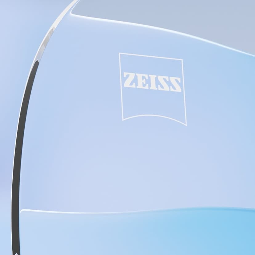
Found Studio Visualises the Space Between the Eye and the Brain
Found Studio is probably the most consistent producer of high-craft, generative motion films working right now — their IBM Quantum work covered in last month's roundup is the same family of work. For Zeiss ClearMind — the brand's first prescription lenses using NeurOptix technology — Found made a launch film that takes the abstract concept (lenses tuned to reduce visual noise and improve cognitive calm) and animates it as a journey from eye to brain.
The visual language is familiar: layered generative graphics, abstract neural motion, cinematic lighting, a palette that reads scientific without reading clinical. You've seen adjacent work — Apple's cognitive advertising, the whole category of neural-science explainer films. What Found brings is the craft. The compositions are confident, the transitions are controlled, the system reads as engineered rather than painted.
"Our challenge was to make the invisible connection between visual clarity and mental well-being visible." — Found Studio
The interesting strategic point is that Zeiss chose to position a lens product around mental well-being rather than optical correction. That's a big reframing — it turns the product from a healthcare category into a wellness category. The design needed to be cinematic enough to earn that reframing, and Found's film is.
What Ties It All Together
Six of this week's seven projects are in categories where design was, until recently, considered secondary to the product. Hotel software. HR software. Performance drinks. Lenses. A mascot-free YouTube notification. A sandal brand that lived on the beach for fifty years.
The seventh — MACBA — is in a category where design was historically the whole point, and the design came out more generic than the operational systems around it.
That contrast is worth sitting with. It's a rough signal about where the interesting work is moving. When a PMS for hotels gets a more confident identity system than a contemporary art museum, the old hierarchy of "glamour categories" and "boring categories" is finally starting to break. Every category is a design category now. The only question left is which studios are paying attention.