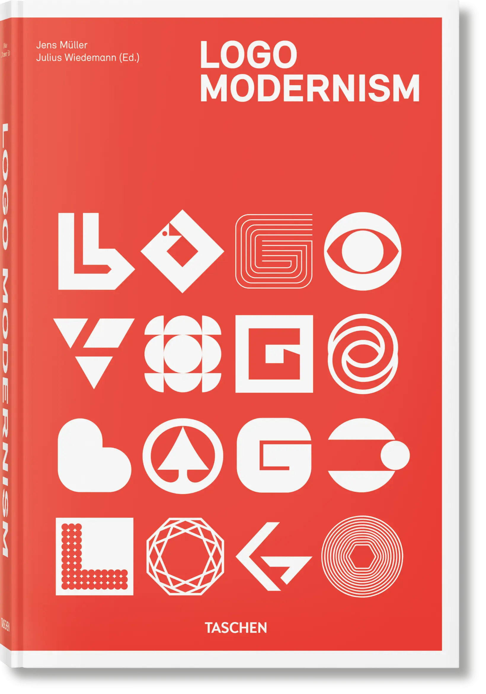
Two TASCHEN books with Logo Modernism in their titles can look like different formats of the same purchase. Their catalogue descriptions reveal a more useful distinction: one concentrates on modernist trademarks, while the other combines material from two books and reaches further back in time.
For a designer building a reference library, the first decision is therefore about the scope of the research. Do you want to compare marks within a particular historical period, or trace a longer development?
The large Logo Modernism volume
TASCHEN’s Logo Modernism, by Jens Müller with a contribution from R. Roger Remington, gathers approximately 6,000 trademarks from 1940 to 1980. Its catalogue is arranged around geometric, effect-based and typographic approaches. The publisher lists a 432-page hardcover, measuring 24.6 × 37.2 cm, in a multilingual English, French and German edition. Its ISBN is 9783836545303. Publisher’s page for Logo Modernism.
That combination of a focused period and a large physical format makes it the edition to investigate when your priority is comparing many examples of modernist marks. The dimensions are also a practical consideration: measure your shelf and the desk space where you expect to use it.
What changes in the 45th Edition?
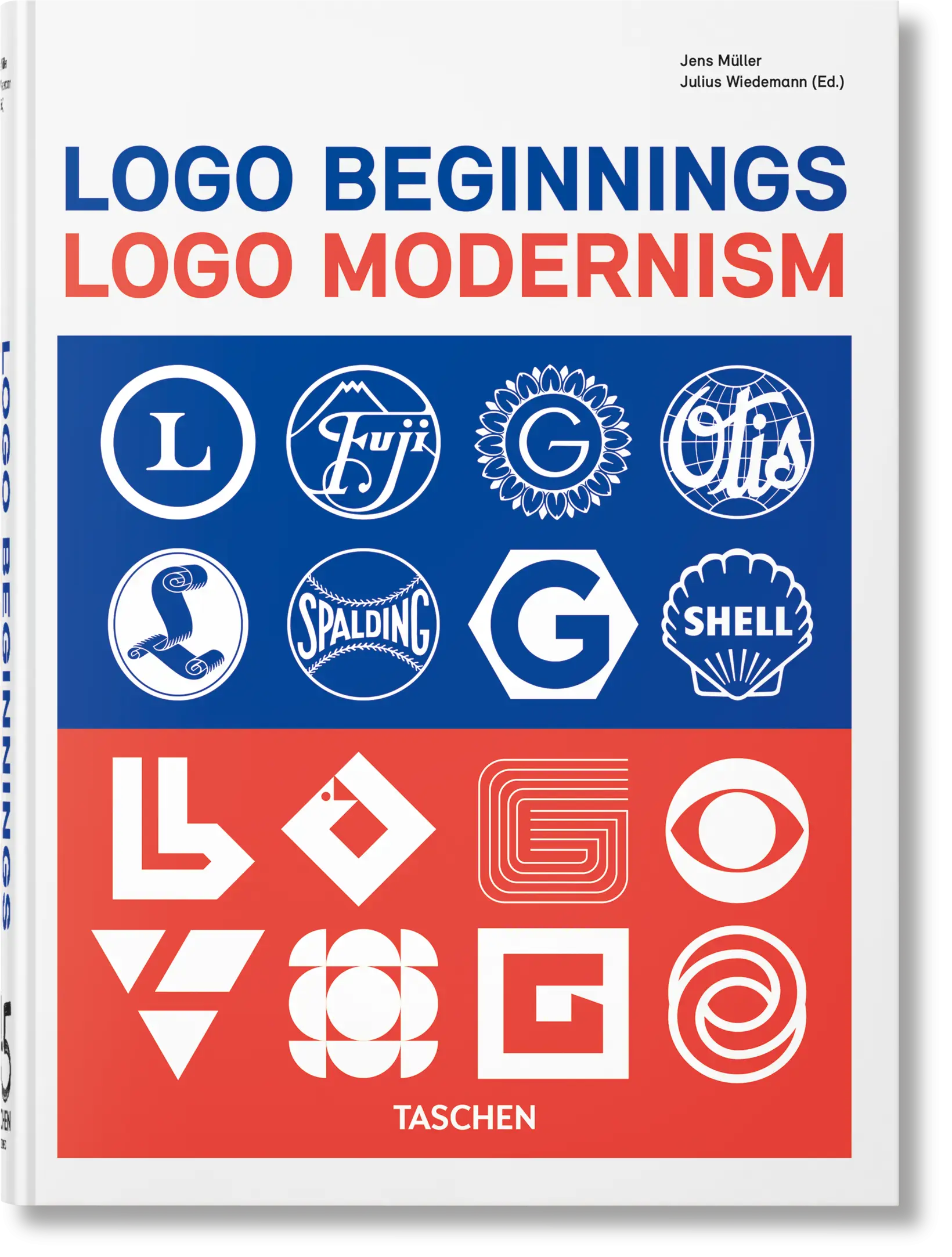
Logo Beginnings. Logo Modernism. 45th Ed. combines material from Logo Beginnings and Logo Modernism. TASCHEN describes more than 3,000 logos, extending from the mid-nineteenth century to 1980. This is a 512-page hardcover measuring 15.6 × 21.7 cm, also in English, French and German. Its ISBN is 9783754401378. Publisher’s page for the combined edition.
A higher page count does not mean a larger logo collection: the published totals and page dimensions differ. Check the full title and ISBN before comparing retailer listings. Do not assume that a listing which abbreviates the name to “Logo Modernism” identifies the edition you intended to buy.
How to use a logo reference book
Our suggested research method starts with a constraint from your own brief. Perhaps a symbol must remain recognisable at a small size, accommodate several languages or work beside a long organisation name. Write that constraint down before browsing.
Build a small comparison sheet in your own words: describe the underlying construction, what makes the silhouette distinctive, and which details would disappear at a smaller size. Then close the reference and sketch several solutions to your actual brief. This keeps the historical material connected to a problem you can explain.
It is also useful to ask what the isolated mark cannot tell you. How does an identity behave across text, photography, signage and motion? Follow your logo research with contemporary studio projects and look for those applications. A visual resemblance alone does not establish that one designer influenced another.
Where to buy
Compare the full title and ISBN before ordering: these are two different editions.
Publisher and bookstore links identify the edition above; Amazon opens an ISBN search. Check the seller’s language, printing and delivery region before ordering.
Choosing your next design book
Choose between these editions by scope and working format, then check current regional pricing on the publisher’s pages. To study a designer behind landmark corporate identities, explore our Paul Rand guide. For text hierarchy and layout, our Thinking with Type guide covers a different research need. For a designer’s explicit account of visual principles, see The Vignelli Canon.
This comparison uses TASCHEN’s edition specifications, checked on 23 October 2026. It does not assess the physical copies’ print quality or promise continuing stock availability.