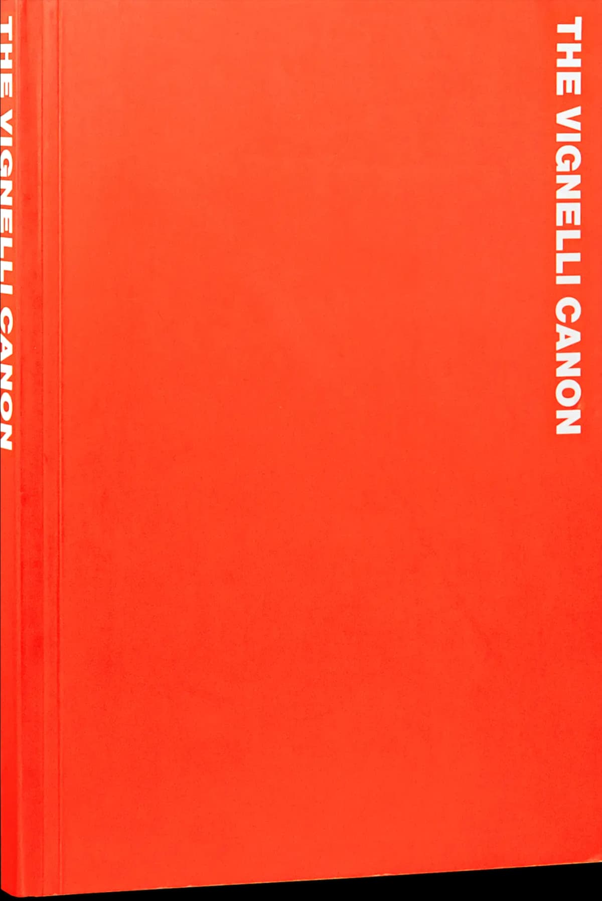
A design handbook becomes useful when it helps you explain a decision. Why should these pages share a structure? Which changes belong inside the system, and which changes weaken it? The Vignelli Canon offers one designer’s position from which to ask those questions.
This introduction describes the book’s published scope and proposes a way to bring it into a critique. It is a starting point for reading, rather than a claim that a single approach can settle every brief.
What the book covers
Massimo Vignelli’s handbook divides its subject into intangibles and tangibles. Lars Müller Publishers describes the first part through concepts including semantics, coherence and appropriateness; the second addresses grids, typography, colour and layout. Examples draw on Vignelli’s own projects. Read the publisher’s description.
The English paperback is listed at 112 pages, with 142 illustrations, measuring 14.8 × 21 cm. Its ISBN is 9783037782255. The publisher calls the currently listed version the sixth edition, while retaining 2010 in the bibliographic details and naming several subsequent editions. That date should not be mistaken for a claim that every copy on sale is the original printing.
Who is it useful for?
We would put it on the reading list for someone trying to make a family of outputs hold together: a publication, an event identity, a presentation series or a set of information pages. The productive question is whether you can describe the relationship between the pieces before discussing their individual styling.
That does not require agreement with every principle. A critique can be more revealing when you state where an approach fits the task and where it does not. A deliberately disruptive poster, for example, may have a different purpose from a page that helps someone locate essential information quickly. Begin with that purpose when deciding what consistency should mean.
For a closer focus on arranging text, pair the reading with Thinking with Type. For historical examples of marks, use the Logo Modernism edition guide.
A practical critique exercise
Here is a D1S1 exercise to try with your own work, rather than an exercise attributed to Vignelli. Select three outputs from the same project. Place them together and write down the decisions that repeat: alignment, type hierarchy, spacing, colour roles and the way images meet text.
For each decision, add a short explanation of what it helps the audience do. If the only explanation is that the designer prefers it, test an alternative. If the explanation concerns recognition or finding information, check whether the three outputs actually support it in the same way.
Then introduce a difficult fourth output: a very long title, a small screen or a layout without an image. Keep the essential relationships and adapt the rest. This is a useful way to discover which rules are robust and which depend on unusually convenient sample content.
Finish by comparing a project in the D1S1 studio directory. Use only what the studio documents when discussing intent; your reading of a visual relationship should be identified as interpretation.
Where to buy
Publisher and bookstore links identify the edition above; Amazon opens an ISBN search. Check the seller’s language, printing and delivery region before ordering.
Finding the right edition
Use the publisher’s page to confirm the language, ISBN and current availability. This guide concerns the English paperback; other language editions can have different identifiers. Catalogue information was checked on 23 October 2026. The observations above are reading suggestions, not a hands-on review of binding, reproduction or paper.