Choosing a typography book starts with a practical question: are you trying to identify typefaces, arrange text, or understand why a layout feels difficult to read? Thinking with Type belongs on the shortlist for the second and third questions. This guide introduces its published scope and suggests ways to connect it with your own work.
What is in the third edition?
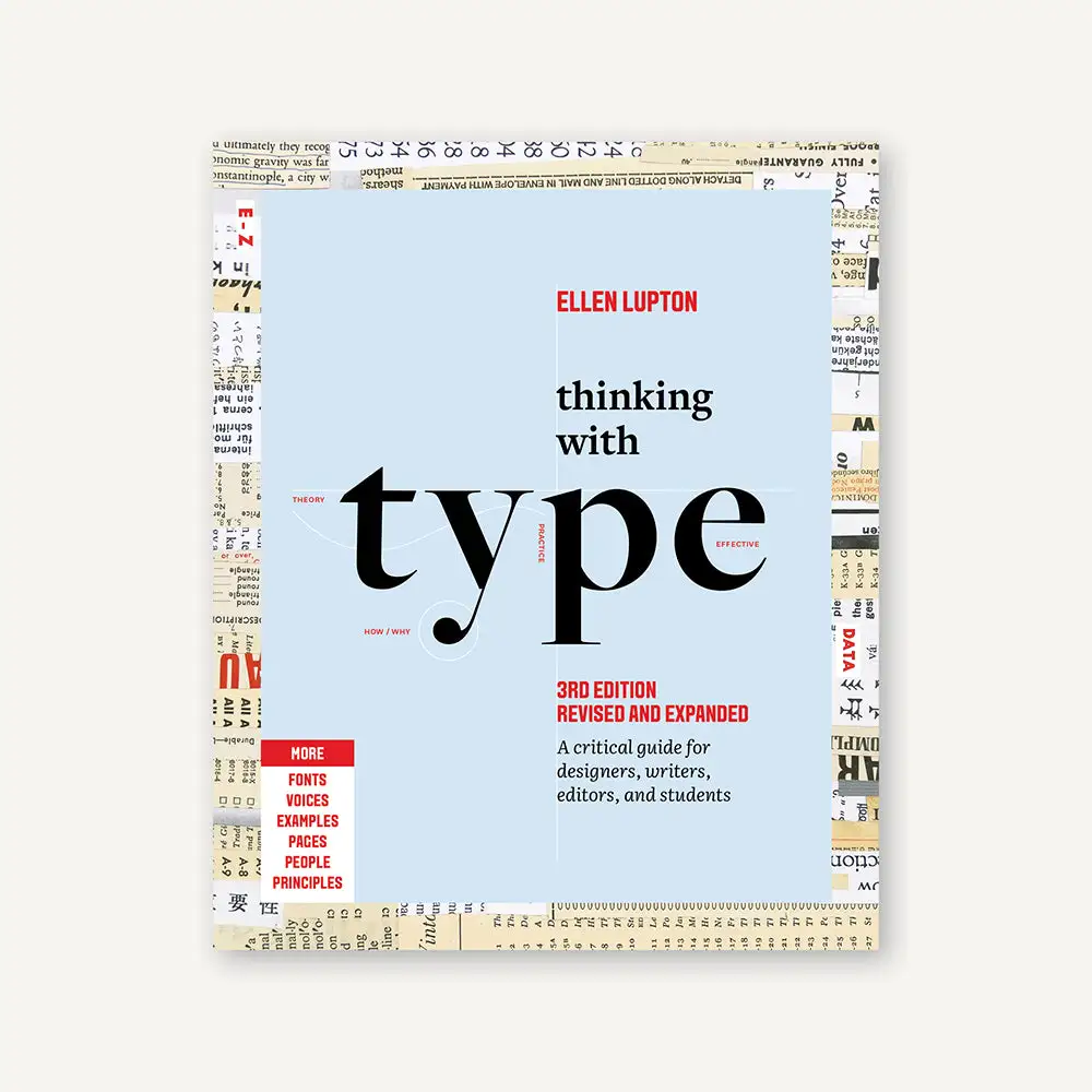
Ellen Lupton’s Thinking with Type: A Critical Guide for Designers, Writers, Editors, and Students was revised for a third edition in 2024. The publisher describes expanded coverage of type families, spacing, alignment and grids, alongside exercises and examples. The revision adds 32 pages and includes contributions about different writing systems, more work by women and BIPOC designers, and material from the Letterform Archive. Publisher’s edition description.
The edition matters when comparing copies. A listing for an older paperback may share the main title while containing different examples. Look for third edition, revised and expanded, and the ISBN 9781797226828. The publishing catalogue lists a 256-page paperback. Edition details.
Who should consider it?
For a student, a useful starting point is a piece of work that already exists: a poster, a presentation or a short article. For a working designer, choose a layout that has survived several rounds of revisions but still feels awkward. In either case, having real content makes the reading easier to test.
Our suggested question is specific: does the reader know where to begin, what belongs together and what comes next? A page can contain a carefully chosen typeface and still fail that test. Look at the relationship between headings, paragraphs, captions and empty space before replacing the font.
If you are primarily looking for a collection of historical logos, the separate Logo Modernism guide addresses that kind of reference research. If your question concerns the reasoning behind a consistent visual system, see The Vignelli Canon.
A reading exercise for your next layout
Try this D1S1 exercise alongside your reading; it is not reproduced from the book. Take one page of your own text and produce three versions while keeping the typeface and words fixed. Change the line length in the first, the spacing between paragraphs in the second, and the hierarchy of headings in the third.
Compare them at the size in which someone will actually read them. Ask another person to find one piece of information without explaining the layout first. Note where they hesitate. That gives you something more useful to discuss than which version looks more fashionable.
Next, browse typefaces used in documented projects. Compare the role of the type, rather than only its name: a large display headline and a dense information panel have different jobs. Keep a short record of the decisions you would borrow and the conditions that make them work.
Where to buy
Publisher and bookstore links identify the edition above; Amazon opens an ISBN search. Check the seller’s language, printing and delivery region before ordering.
Edition and source notes
This is an introduction based on the publisher’s description and edition catalogue, not a hands-on assessment of paper, binding or print quality. Edition information was checked on 23 October 2026. Follow the publishing link for current availability in your region; older editions and translations should be checked separately.