There's a quiet theme running through this week's picks: imperfection as an asset. Not the staged, "humanising" kind big brands talk about in decks — the actual kind. A phone that asks you to smile by being weird at you first. A soda that puts the gap between the founder's teeth on the label. A speaker wrapped inside a literal candy. And a cultural platform that stops pretending it has all the answers and starts offering therapy to designers instead.
Four projects, four studios, one shared instinct — drop the polish, keep the personality.
Buck Turns the Pixel 9 Pro Fold's Outer Screen Into a Stage
"Say cheese" is the most awkward sentence in the English language. It's the moment the smile dies. Buck and Google's answer for the Pixel 9 Pro Fold is to not ask for the smile at all — and instead to put a tiny, animated character on the phone's outer display that reacts to you in real time and tricks your face into doing the work.
Made You Look uses the cover screen as a miniature performance space. A cast of whimsical characters — original creations alongside licensed faces like Pixar's Inside Out Joy — hold poses, wait, react. Machine learning reads the subtle cues in the subject's face; the animation responds in kind. The point is not to document a smile, it's to provoke one.
The next iteration should include the option to say "leave me alone, I'm working." Not every smile needs a soundtrack.
Buck is sticking to what Buck does best: storytelling-first character animation that reads cleanly at small scale. The interesting product question isn't "does this sell more foldables" — it's "what other surfaces on a device could be given this treatment?" The outer screen of a folding phone has been a solution in search of a brief for three years. This is the first brief that makes the surface feel like a feature instead of a consolation prize.
Saint-Urbain Builds a Soda Brand Around a Gap
Most consumer-packaged brands in the US still run on a simple logic: cover the flaws, lead with the idealised version, hide the human. Saint-Urbain went the other way for Gap Tooth Soda and built the entire identity around the founder's gap-toothed smile — handling naming, strategy, identity, and packaging as a full system.
The visual language leans into asymmetry, direct typography, and deliberately naive illustration. The fruit illustrations look like layers of semi-translucent cut paper, stacked and slightly off-register — a folk-art register that reads more like zine printmaking than packaging design. They carry two references at once: a faint zine/skater-subculture edge and a clean, Notion-era friendliness. It's a distinctive blend, and it's what makes the packaging work.
Imperfection as identity, not imperfection as decoration. There's a difference, and this one earns the distinction.
A fair critique: a soda leaning into the gap tooth metaphor has a small on-the-nose problem. Drink a lot of anything sweet and the gap might stop being aesthetic. But the branding is clearly not about the dental science; it's about belonging. Communicating with a niche group — the people who already like the thing most brands tell them to hide — is a valid positioning strategy. This one commits.
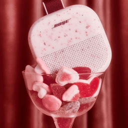
Hello Comrade Wraps a Bose Speaker Like a Giant Candy
Influencer mailers are a category unto themselves at this point — and most of them are forgettable: kraft box, tissue paper, branded card, done. Hello Comrade got the Valentine's Day brief for Bose's collaboration with Swedish confectioner BonBon and built the packaging as a giant candy wrapper. You don't open a box to find the speaker; you unwrap it, the way you'd unwrap a sweet.
Inside: a Petal Pink SoundLink Micro paired with a curated BonBon candy mix. The colourway links the two brands without either one having to visually bend to the other. Bose's pink and BonBon's Swedish-candy palette sit in the same register.
It's a straightforward piece of craft — the kind of project where the idea and the execution are the same thing. Unwrapping a speaker like a toffee is the idea. There's nothing else you need to read into it, and that's the strength.
Sweet sound, literally delivered. A rare piece of product marketing where the joke and the object agree with each other.
The move that matters strategically: Bose is a serious audio brand, BonBon is a boutique Stockholm candy maker, and neither had to compromise. The packaging is doing the translation work. That's the cleanest definition of a collaboration.
DixonBaxi Turns a Festival Into an Institute
DixonBaxi keeps showing up in these roundups, and for good reason — they're one of the few large identity studios still willing to take on work where the brief is purpose rather than rollout. The Paradiso project is one of those.
Paradiso started as a single cultural moment — a creative gathering. DixonBaxi's work here is to evolve it into Paradiso Institute: a global platform for creative leadership, cultural responsibility, and — the more unusual part — emotional well-being for people who make things. Education, certification, community initiatives. The scope is movement-design more than identity-design.
The visual language is where it gets interesting. The listed keywords read like a manifesto: raw, instinctive, organic, defiant, experimental, primal. That is a deliberate move away from the polished, Helvetica-and-grid look that most cultural institutions default to. Paradiso is explicitly trying to look like it isn't a cultural institution — and that framing gives designers a space that feels more like a workshop than a museum.
There's a reading of this that's quietly radical. The creative industry has spent a decade optimising for output — portfolios, case studies, engagement, growth. Paradiso's pitch is closer to creative therapy: slow down, be more honest, pay attention to the people doing the work. That's a platform, not a logo.
Creative honesty as a new kind of paradise. The brand system is doing movement-building work, not visual-consistency work.
Whether that message survives contact with reality — i.e. the scale, the funding, the certification programme — is a separate question. But as an identity brief, it's one of the more ambitious ones we've covered this year.
What Ties It All Together
Every one of these four cases is a studio making a deliberate choice to look less tidy than it could have.
Buck could have animated a polished product demo and called it a day. Saint-Urbain could have made Gap Tooth Soda into another clean beverage brand with a nice serif. Hello Comrade could have shipped a box. DixonBaxi could have logo'd an event.
None of them did. Each one found the detail that makes the work feel human — the tooth, the wrapper, the character's wait-pose, the word defiant in a cultural brand's keyword list — and made that detail load-bearing.
The takeaway isn't "be weird." The takeaway is that the smallest non-generic decision — the one you're tempted to clean up in round two — is often the only part of the work that people will actually remember.