Brand Identity and Packaging for Gap Tooth Soda
How do you design a brand that celebrates flaws?
Saint-Urbain developed the naming, strategy, identity, and packaging for Gap Tooth Soda, a botanical soda brand that celebrates imperfection. Inspired by the founder’s gap-toothed smile, the design embraces asymmetry, expressive typography, and playful illustration to create a distinctive and human brand presence across flavors and formats.
Insights- The creator angle is the core story: Saint-Urbain turned “perfect imperfection” into the brand’s message for Gap Tooth Soda, using a gap-toothed smile as the founding inspiration and making celebration of flaws part of the identity.
- Saint-Urbain handled naming, strategy, identity, and packaging, so the project wasn’t just a label design; it was a full brand system for a botanical soda brand across flavors and formats.
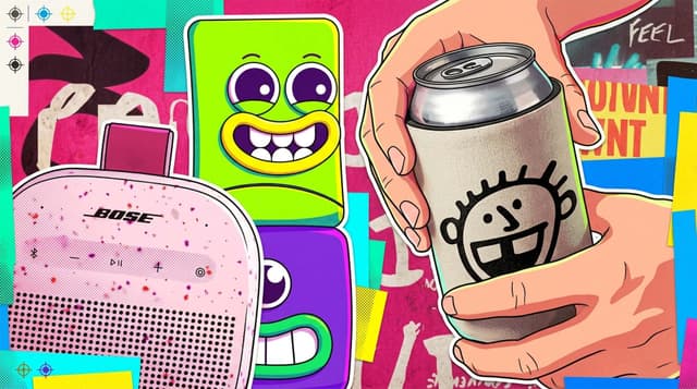
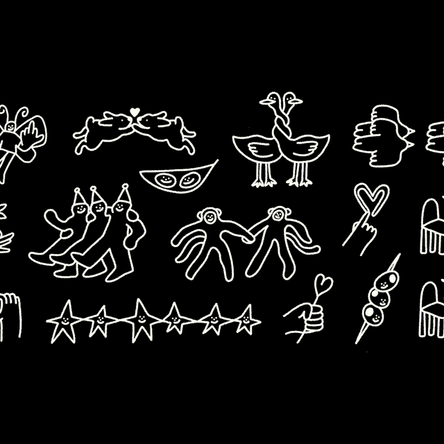
- The visual language leans into asymmetry, expressive typography, playful illustration, and a colorful, human feel to make the brand look deliberately irregular rather than polished and generic.
- The work stands out in food and beverage packaging because it uses imperfection as a design asset, creating a distinctive presence that feels more personal and illustrative than typical soda branding.