Untitled Case
Classical proportions, sharp interruptions
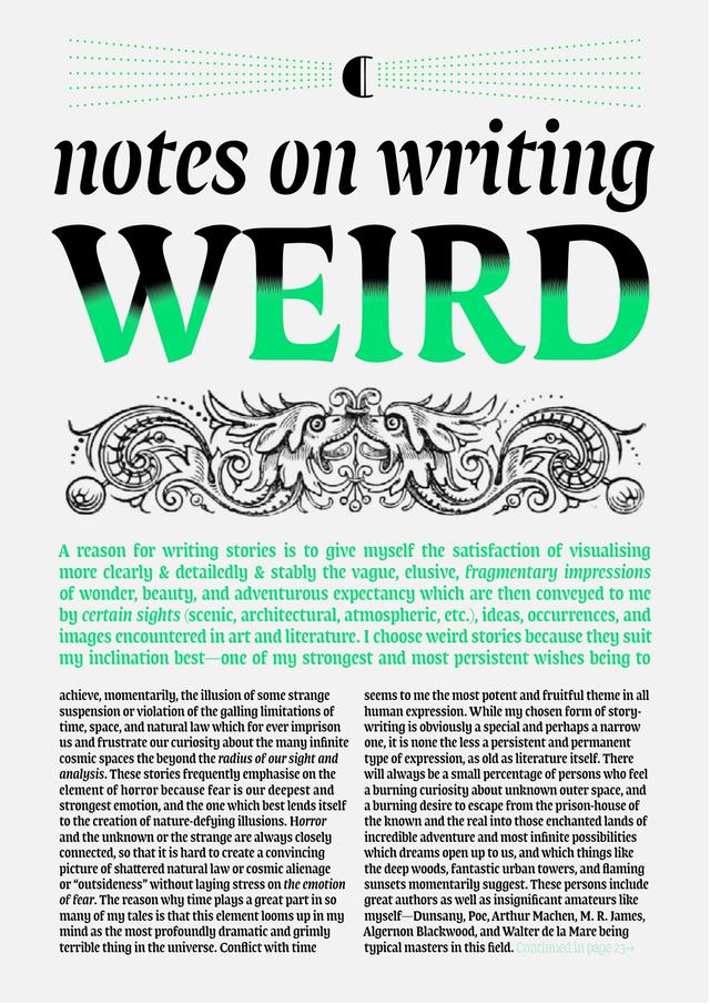
Rapida is a serif text family designed by Michelangelo Nigra and released by Typotheque in 2021. It pairs classical proportions with abrupt angular interruptions to animate continuous text at small sizes in print and on screen. The design grew from a historical investigation into how italic evolved from a cursive counterpart to Roman type into a distinct typographic entity with its own voice. A companion display family, Rapidissima, extends the concept as an exclusively italic typeface representing an extreme expression of speed.
Set in Rapida
Insights
- The family's research foundation lies in tracing how italic shifted from a companion style to Roman type into an independent typographic entity.
- Each weight ships with eight numeral variants: proportional lining (default), old-style, tabular lining, tabular old-style, superior, inferior, circled, and circled inverted.
- Rapidissima, available exclusively as Italic, is the companion display typeface presenting an extreme visual rendering of the idea of speed.
Related articles
1 / 4Swipe
Keep exploring
Related cases