Untitled Case
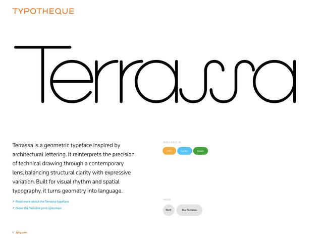
Three optical sizes engineered for the full hierarchy of newspaper typography
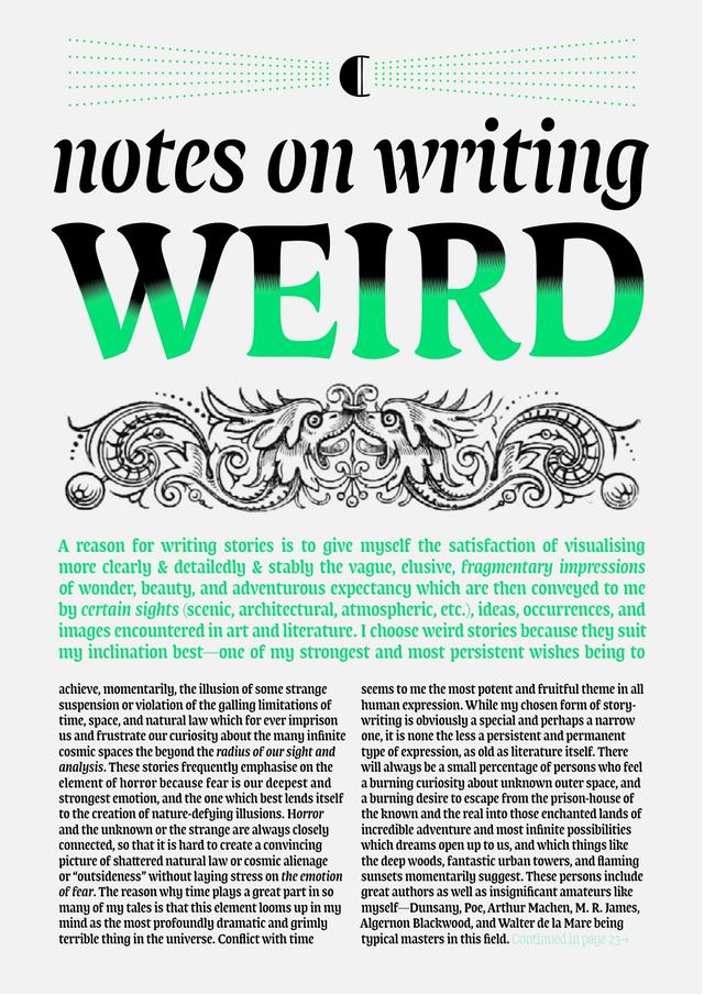
Greta Display is the headline-optimised optical size within the Greta Serif system, a contemporary serif family built for the demands of newspaper printing. The Display cuts target the 14–21pt range, featuring higher contrast, tighter spacing, and more refined details than the Text cuts. Latin, Greek, and Armenian were designed by Peter Biľak; Cyrillic by Gayaneh Bagdasaryan and Alexei Kassian; Georgian by Akaki Razmadze; Hebrew by Michal Sahar; and Thai by Smich Smanloh. Typotheque compiled an extensive symbol library—monetary signs, weather icons, chess figurines, zodiac sets, and infographic markers—drawn from analysis of periodical publishing needs.
Set in Greta Display
Insights
- Optical sizing is defined by precise point ranges: Text at 8–11pt, Display at 14–21pt, Grande for the largest titles.
- Each weight ships with nine numeral variants—proportional oldstyle, lining, tabular (both styles), small-caps, superior, inferior, circled, and circled inverted—switchable via OpenType.
- The symbol set was compiled from a systematic audit of newspaper and magazine content categories rather than generic dingbat conventions.
Related articles
1 / 4Swipe
Keep exploring
Related cases