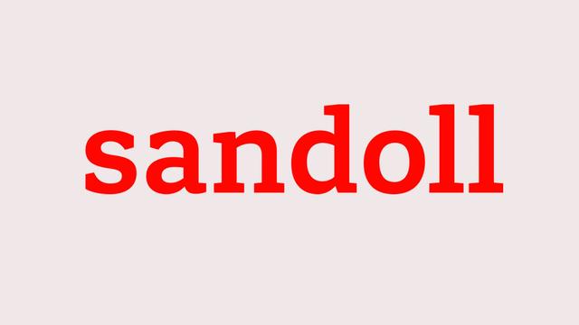
Custom Typeface for Sandoll
A foundry's own building becomes the brief
Sandoll, Korea's oldest and most renowned type foundry, commissioned TypeTogether to develop a three-style Latin family—Sandoll Slab Light, Sandoll Slab Semibold, and Sandoll Headline—to improve its market position with global customers. The brief drew on keywords such as 'living stone' and 'connected,' with architectural references including the Sandoll headquarters' open-faced brick and wood-cladding façade. The Semibold also serves as the basis for the Sandoll logotype. TypeTogether worked from Sandoll's internal sketches, refining them into a family for print, digital, and advertising use.
Set in Sandoll Slab, Sandoll Headline
Insights
- Initial exploration used only the string 'videospan'—characters chosen to establish typeface DNA before expanding the full set.
- Two text proposals diverged on serif treatment: one fluid and open, the other stiffer, which was later redirected into the Headline style.
- The Headline shares stem width, contrast, and letter construction with the Semibold, but its serifs and terminals are geometric and architecturally constructed.
- Terminals on 'a' and 's' were redesigned to open counters and add a baseline outstroke for greater recognisability.
Related articles
1 / 6Swipe
Keep exploring
Related cases


