Sandoll
Design work for Sandoll, collected from the studios behind it.
- Design cases
- 2
- Studio
- 1
- Latest work added
- Nov 2026
- Typography 2
Design cases by studio
TypeTogether (2)
- Custom Typeface and Logotype for Sandoll
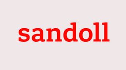
- Sandoll, Korea's oldest type foundry, commissioned TypeTogether to design a custom Latin typeface as part of a rebrand, with the Semibold weight serving as the basis for a bespoke logotype. Rather than simply setting the brand name in the new font, TypeTogether modified individual letterforms — aligning serifs, adjusting spacing, and refining the 'sa' terminal combination. A distinct small/web version, designated for use below 18pt, received more pronounced changes: serifs were made slabbier, spacing was opened up, and sharp corners were added to terminals on 's' and 'a'. The identity was deployed across the updated website, merchandise, specimens, and 3D signage at Sandoll's Seoul headquarters.
- Custom Typeface for Sandoll
- Sandoll, Korea's oldest and most renowned type foundry, commissioned TypeTogether to develop a three-style Latin family—Sandoll Slab Light, Sandoll Slab Semibold, and Sandoll Headline—to improve its market position with global customers. The brief drew on keywords such as 'living stone' and 'connected,' with architectural references including the Sandoll headquarters' open-faced brick and wood-cladding façade. The Semibold also serves as the basis for the Sandoll logotype. TypeTogether worked from Sandoll's internal sketches, refining them into a family for print, digital, and advertising use.