Custom Typeface and Logotype for Sandoll
Why typing a font never makes a logo
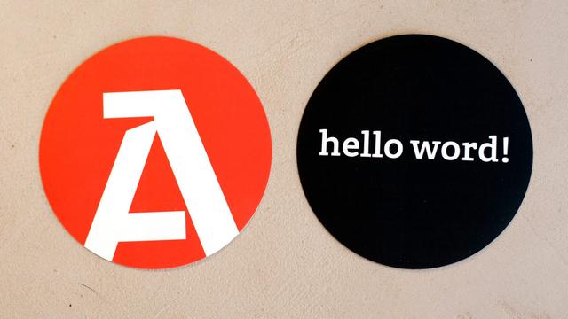
Sandoll, Korea's oldest type foundry, commissioned TypeTogether to design a custom Latin typeface as part of a rebrand, with the Semibold weight serving as the basis for a bespoke logotype. Rather than simply setting the brand name in the new font, TypeTogether modified individual letterforms — aligning serifs, adjusting spacing, and refining the 'sa' terminal combination. A distinct small/web version, designated for use below 18pt, received more pronounced changes: serifs were made slabbier, spacing was opened up, and sharp corners were added to terminals on 's' and 'a'. The identity was deployed across the updated website, merchandise, specimens, and 3D signage at Sandoll's Seoul headquarters.
Insights
- The Semibold weight of the custom typeface was selected from the outset as the basis for the logotype, linking type system and brand mark by design intention rather than retrofit.
- Logotype modifications at standard size were relatively minor: serif alignment, spacing tweaks, and terminal refinement on the 'sa' pair.
- The small/web logo variant (for use below 18pt) received more structural changes — straightened slab serifs, wider spacing, and sharp terminal corners on 's' and 'a' — which the studio describes as being for better definition.
- The studio distinguishes between alphabet design (letters optimised for any context) and logotype design (letterforms optimised for a fixed word), treating them as fundamentally different tasks.
Related articles
1 / 6Swipe
Keep exploring
Related cases


