Parker Institute
Small squares map a bigger cancer-research ecosystem.
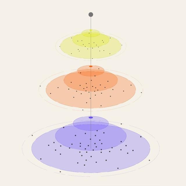
Pentagram repositioned the cancer immunotherapy nonprofit Parker Institute with a shortened name, the tagline “Cancer Ends Here,” a new identity and a website developed with Decimal Studios. A condensed sans serif logo and energetic colors sit alongside a bookish serif and photographs of the people behind the research. Squares represent researchers, labs, innovations and companies, while overlapping animated layers explain how discoveries progress through intellectual-property development to new biopharma ventures.
More in blue
Insights
- Shortening Parker Institute for Cancer Immunotherapy to Parker Institute creates a simpler public-facing name without changing the research mission.
- The square provides a repeatable unit for showing different participants and outcomes across a complex network.
- Animating overlapping phases makes the institute’s research-to-company model part of the identity rather than leaving it only in explanatory copy.
- Condensed display typography and energetic colors establish a forceful voice, balanced by a bookish serif and people-focused photography.
- The website lets visitors explore discoveries, innovation and bioventures as connected parts of one model.
1 / 17Swipe
Keep exploring
Related cases