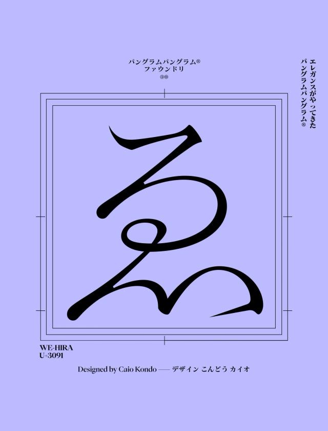
Typeface Collection for Pangram Pangram
Wide incise with an extravagant edge
Gatwick is a wide incise typeface distinguished by tapered stems, sharp terminals, and pronounced decorative details that contrast with genre peers relying on uniform proportions and consistent stroke weight. The foundry characterises its aesthetic as exotic and extravagant, resonating with both vintage and contemporary sensibilities. Version 2.0 expanded the family with two high-contrast subfamilies aimed at headline and subtitle use.
Set in Gatwick
Insights
- The typeface deliberately rejects the uniform stroke weight common in the incise genre in favour of tapered stems and sharp terminals.
- Version 2.0 introduced two distinct high-contrast families, broadening typographic range within a single release.
Related articles
1 / 7Swipe
Keep exploring
Related cases


