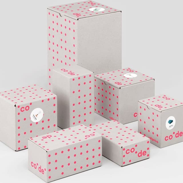
Brand Identity for a Patent Research Firm
Opposite collaborated with GreyB, a Singapore-based professional services firm specializing in patent research and intellectual property strategy, to develop a cohesive brand identity and visual language. The design centers on a geometric 'g' monogram that serves as a flexible visual device across various applications, from publications to presentations.
Keep exploring
Related cases