Typeface Design for Bagoss
From rough sketch to refined multi-width family
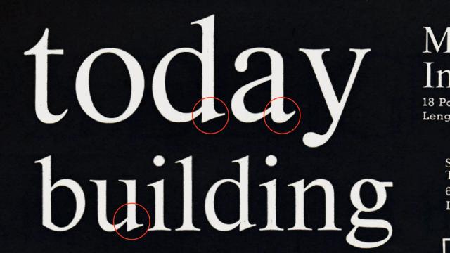
Bagoss began as a crude condensed sans-serif with a large x-height and diagonal terminals. Over time the design gained stroke contrast and a tiny single-edge serif, sharpening its character. The family expanded into three subfamilies spanning condensed to expanded widths, with OpenType features that expose cursive alternates.
Set in Bagoss
Insights
- The design evolved by adding stroke contrast and a single-edge serif to an initially plain condensed skeleton.
- Width range grew across three distinct subfamilies, spanning condensed to expanded.
- Cursive letterform alternates are accessible via OpenType features.
Related articles
Keep exploring
Related cases


