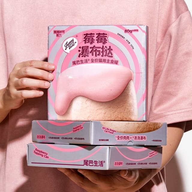
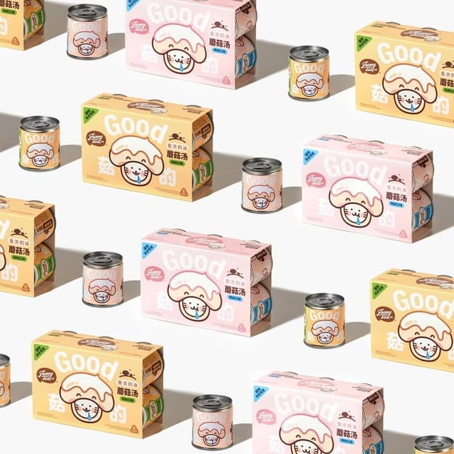
DXD Studio created packaging for 尾巴生活® pet staple food, centered on the theme of shine. Lustrous materials and finishes pair with layered typography to convey silky, radiant pet fur and a premium product experience.
The Dieline article showcases Floraison’s beer packaging, which combines delicate floral illustrations with bold yellow and orange typography. The design achieves a gender-neutral aesthetic through muted tones and soft backgrounds, balancing elegance with visual impact.
The Dieline article highlights DXD studio’s packaging design for Good Poo, a digestive health brand that embraces humor and approachability. The design uses bright colors, a grid layout, and bold typography to move away from sterile pharmaceutical aesthetics, creating a lighthearted and consumer-friendly identity.