Typeface Expansion for CoFo Cinema1909
A typeface born from capital letters learns to speak in lowercase.
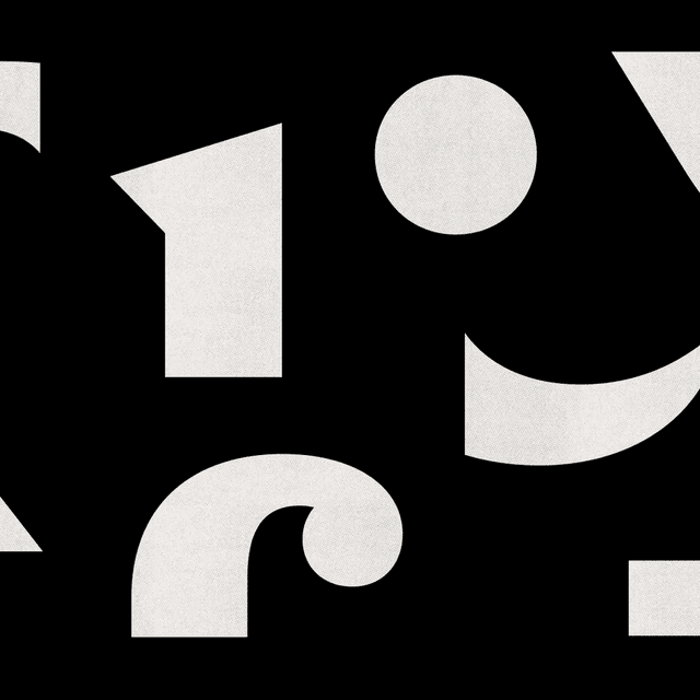
Contrast Foundry expanded CoFo Cinema1909 with lowercase letters designed to retain the original display typeface’s tight spacing and compact proportions. The update also adds oldstyle figures, fractions, matching currency symbols and regional alternates.
More in white
Insights
- The original Moscow Metro lettering offered no lowercase models, so Liza Rasskazova and intern Manau Quellec developed the new letters from scratch rather than reproducing a historical alphabet.
- A high x-height and short descenders carry the compact appearance of the capitals into mixed-case headlines, preserving the typeface’s tight rhythm.
- The y, f and j received particular attention: their terminals echo the uppercase details while remaining compact enough for difficult letter combinations.
- Oldstyle and lining figures have matching currency symbols; the expanded set also includes fractions and Bulgarian, Serbian and Bashkir alternates.