Orleans
Built for a magazine that never ran it
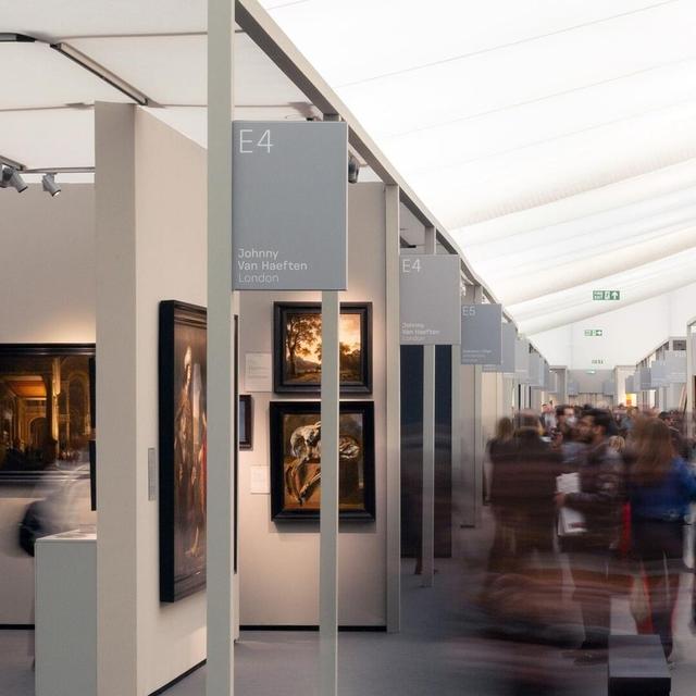
Designed by Paul Barnes in 2016, Orleans is a crisp sans serif display face rooted in broad-nib calligraphic traditions, including blackletter. Originally drawn for a planned redesign of frieze's German edition, the magazine closed before the redesign was implemented. Further developed with Tim Ripper, the family grew to seven weights with italics, debuting in the Commercial Type Vault before its full public release in late 2021.
Set in Orleans
Insights
- Draws on broad-nib letterform traditions spanning both blackletter and calligraphic sans genres.
- Tim Ripper contributed to expanding the family to a seven-weight system with italics.
- Released first through the Commercial Type Vault, with full public release following in late 2021.
Related articles
Keep exploring
Related cases