Stag, Granger, and Gingrich for Esquire
Eleven years, three custom families, one magazine
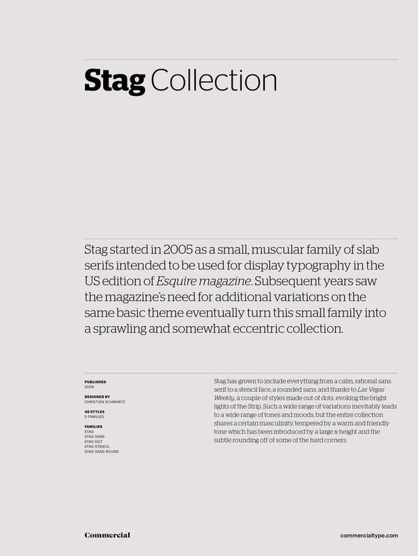
Between 2005 and 2016, creative director David Curcurito commissioned three successive custom type families for Esquire. Stag began as a slab serif and expanded into sans, stencil, and rounded sans variants over six years; Stag Sans was later replaced by Graphik. Granger, designed by Kai Bernau and Susana Carvalho, was intended to replace both Stag and Mercury; it was later reworked and released publicly as Algebra. Gingrich, a condensed high-contrast serif in four optical sizes, was created for the magazine's 1000th issue and remained in use until Curcurito's departure.
Set in Stag, Stag Sans, Stag Stencil, Stag Sans Round, Granger, Gingrich
Insights
- Stag's Thin weight retained exaggerated bracketing and blunt terminals rather than stripping them, because removing those details caused the face to lose its personality at light weights.
- Stag Sans originated by cutting the serifs off Stag; surviving quirks—blunted terminals and soft notch corners—inadvertently echoed legibility techniques Matthew Carter used in Bell Centennial and Verdana.
- Stag Stencil was cut by Berton Hasebe to give the front-of-book style section a distinct identity; Stag Sans Round was drawn by Ross Milne to soften the Man at His Best section.
- Gingrich was designed around sharp, triangular forms to contrast with Granger's superelliptical rounds and Graphik's circular construction; the angled stress of Times New Roman was a reference that kept the face from reading as rigid.
Related articles
Keep exploring
Related cases