← Back to Fonts
Milano — 1 case
Used by Wedge
Set for Diana's Seafood
Cases set in Milano, as credited by the studios in their own writeups.
Milano in the news
- Wedge Transforms Diana's Seafood for New Home Cooks
Creative Boom · Apr 30, 2025
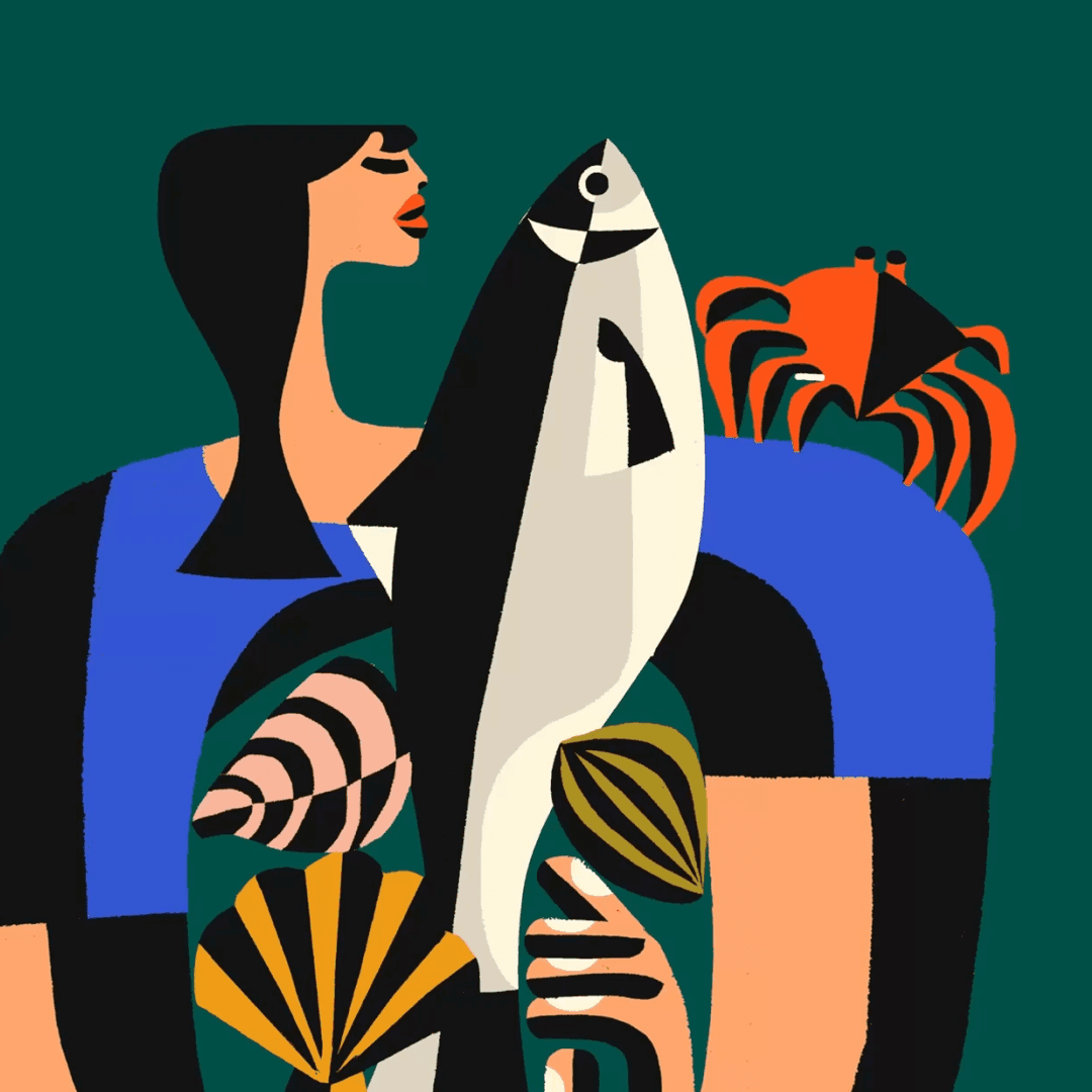
Creative Boom features Wedge’s rebrand of Canadian seafood supplier Diana’s, repositioning it from a chef-focused B2B brand to a consumer-facing identity. The new design celebrates the brand’s matriarchal roots with a warm, contemporary visual system featuring vivid blue tones, variable typography, and expressive illustration. The project blends heritage and modernity to make premium seafood accessible to everyday home cooks.
- Wedge Revitalizes Diana’s Seafood Brand, Embraces New Generation
It's Nice That · Apr 14, 2025
Wedge has rebranded Canadian seafood company Diana’s Seafood with a new identity that blends heritage and modernity. The project uses contrasting typefaces Martin and Milano, a blue-heavy palette, and nostalgic illustrations by Bill Rebholz to reflect the brand’s legacy and freshness. The rebrand positions Diana’s as both traditional and forward-looking, appealing to a new generation of seafood lovers.
- Wedge Revamps Diana’s Seafood, Celebrates Canadian Icon
The Brand Identity · Mar 28, 2025
Montreal-based studio Wedge has rebranded Canadian seafood institution Diana’s Seafood, repositioning it as ‘The Mother of Seafood.’ The new identity draws from the brand’s heritage and authenticity, featuring a refreshed fish symbol, bold typography, and expressive illustrations by Bill Rebholz. The rebrand celebrates Diana’s legacy while modernizing its visual language for a broader consumer audience.