
The contrastless neo-grotesque branch of the Beausite family, with a fashion-world poise. View at Fatype →
Used by Focus Lab, Vanderbrand, Bontemps, Collins
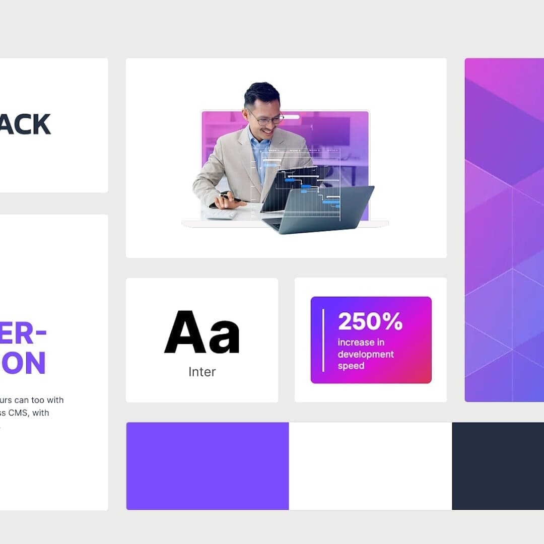
Set for Contentstack, Espacio Nueva Carolina, Langara Construction, Match.com
Cases set in Beausite Classic, as credited by the studios in their own writeups.
The Brand Identity interviews Scottish designer Kurt Green about his freelance studio Human Resources, exploring his journey from co-founding a visual culture blog to running a solo design practice. Green discusses the challenges of freelancing, his approach to client work, and his passion for branding and packaging projects such as Obadiah Coffee. He also shares insights on tools, work-life balance, and future ambitions for collaboration and studio growth.
COLLINS rebranded the online dating platform Match with a sophisticated and calming identity inspired by real-world ambience. The new design features custom typography, gentle gradients, and a tonal palette that evokes warmth and intimacy. The project aims to position Match as a mature and welcoming alternative within the dating app landscape.
Forma designed a refined visual identity and website for Barcelona-based product photographer Marçal Font. Drawing inspiration from the camera dial’s ‘Manual’ mode, the identity features a circular logo and a restrained palette of black, white, grey, and warm brown tones. The typography uses Fatype’s Beausite Classic to complement the minimalist aesthetic.