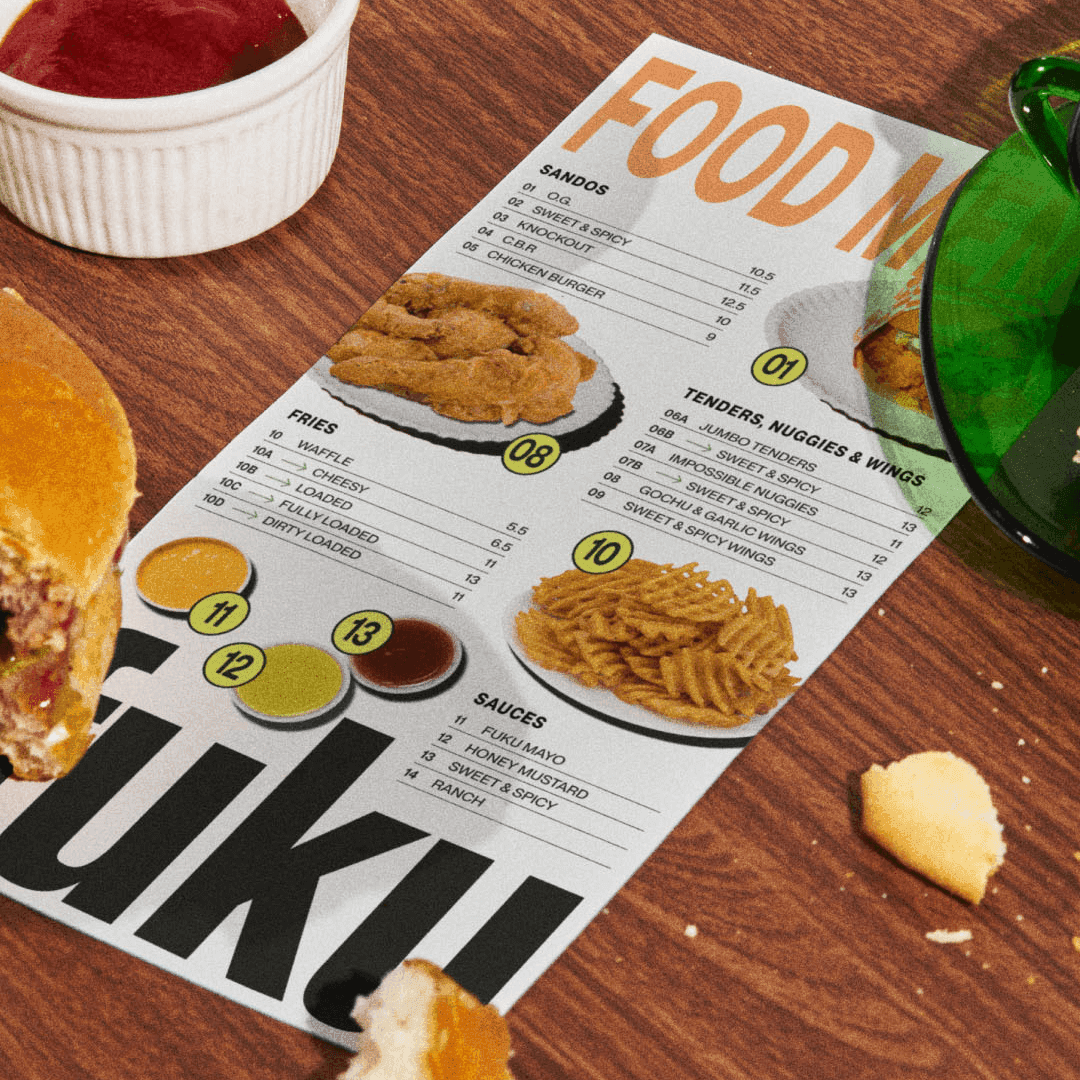
BP&O features Red Antler’s rebrand for Fuku, the fast-casual chicken sandwich brand born from David Chang’s Momofuku. The identity combines bold typography from Pangram Pangram with Akzidenz-Grotesk, dynamic flash photography, and NYC-inspired signage. While the article praises the typography and art direction, it also questions some of the copywriting and visual choices.
Red Antler rebranded New York-based fried chicken restaurant Fuku, refining its iconic wordmark while embracing the gritty, handmade energy of the city. The new identity combines a condensed sans logo with a dynamic type system inspired by street graphics and kitchen culture. The result is a bold, honest, and distinctly New York visual language that celebrates Fuku’s roots and personality.