← Back to Fonts
Aeonik Pro — 1 case
Used by Mast
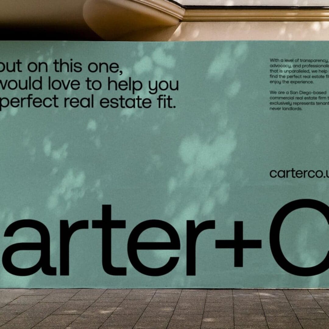
Set for Carter+Co
Cases set in Aeonik Pro, as credited by the studios in their own writeups.
Aeonik Pro in the news
- SEESAW: Transform Data into Insights Instantly
SEESAW · Aug 1, 2024
SEESAW features the website design for Index, a data analytics SaaS platform that turns data into insights quickly. The listing highlights the fonts used and categorizes the project under product management, BI tools, and analytics.
SEESAWIndexdigital - For YATAI 2023, Baillat Studio brings bunnies and blue skies to the festival of Japanese culture
The Brand Identity · Feb 7, 2024
Baillat Studio developed the 2023 identity for Montreal’s YATAI festival, celebrating Japanese culture with a geometric rabbit mascot inspired by the Year of the Rabbit. The design uses Aeonik typeface and a minimal palette of blue, white, and silver to evoke summer skies and clouds. The campaign continues the studio’s long-term collaboration with YATAI, emphasizing simplicity and recognisability.
- AuthKit by WorkOS: UI System for Streamlined Authentication Flows
SEESAW · Nov 29, 2023
SEESAW features AuthKit by WorkOS, a comprehensive UI component system designed to simplify building authentication flows for apps. The article highlights the product’s design and functionality, listing its use of Untitled Sans and Aeonik Pro typefaces.
WorkOSdigital - Nomad creates energetic identity for workout app Mvmnt
The Brand Identity · Nov 28, 2023
London-based strategy and brand experience company Nomad collaborated with Sky Creative and WithU to create Mvmnt's identity, an AI and motion-tracking-enabled home workout app. The system combines an M-shaped pulse symbol, lowercase custom wordmark, Aeonik typography and vibrant gradients, supported by photography from Olly Burn that clearly demonstrates the product in a home setting.
- Reflect: AI-powered note-taking tool by SEESAW
SEESAW · Jul 21, 2023
SEESAW features Reflect, an AI-powered note-taking tool, highlighting its clean and functional website design. The listing notes the use of Inter and Aeonik Pro typefaces and categorizes the project under AI and productivity. The article serves as a brief showcase of Reflect’s digital presence.
SEESAWReflectdigital - How Smörgåsbord created a contemporary, multi-platform identity to unify the Ace creative family
The Brand Identity · May 18, 2023
Smörgåsbord developed a contemporary, multi-platform identity for the creative collective Ace, uniting its family of agencies under a cohesive visual system. The design features a ribbon-inspired logo, motion graphics, and a bold red color palette inspired by Ace’s Amsterdam HQ. The project emphasizes flexibility, movement, and connection across digital and physical applications.