Yoto
Design work for Yoto, collected from the studios behind it.
- Design cases
- 2
- Studios
- 2
- Latest work added
- Oct 2026
- Product Design 1
- Typography 1
Design cases by studio
Studio DRAMA (1)
- Type Family for Yoto
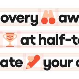
- Studio DRAMA worked with Wild People and Yoto to design a child-first type family for the screen-free audio brand. Yoto Headline and Yoto Text each offer four weights with corresponding italics, sharing a recognisable voice across display and reading settings. Headline begins with playful geometry drawn from Yoto’s devices: curved letters refer to the Mini player, circular forms echo buttons and dials, and the dot on the lowercase i takes its shape from the larger player viewed from above. Softened corners extend into the counters. Text adapts this foundation for smaller sizes, opening terminals, introducing a double-storey a and simplifying the y. Sharper corners and adjusted weighting support clarity. Together, the cuts form part of a refreshed toolkit used across outdoor advertising, packaging and online content.
Pentagram (1)
- Product Redesign for Yoto Player 3rd Gen
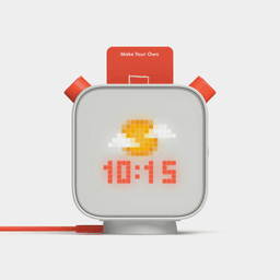
- Pentagram refined the industrial design of the Yoto Player for its third generation, enhancing usability, durability, and sustainability. The redesign introduced a wireless charging dock, smoother nightlight diffusion, improved materials, and easier assembly and servicing, all while maintaining the playful and tactile qualities central to Yoto’s child-friendly experience.