Possible
Design work for Possible, collected from the studios behind it.
- Design cases
- 2
- Studios
- 2
- Latest work added
- Jan 2026
- Brand Identity 2
Design cases by studio
Opposite (1)
- Branding and Packaging for Possible Nutrition Brand
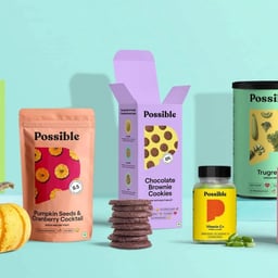
- Opposite rebranded TrueWeight into Possible, repositioning it from a functional weight management brand to an aspirational lifestyle brand. The design introduced a custom 'p' monogram as a 'window of possibility', creating a flexible packaging system adaptable across diverse product types while maintaining strong brand recognition.
Forth+Back (1)
- Visual Identity for Event and Performance Consultancy Possible
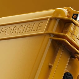
- Forth+Back developed a new visual identity for Possible, an event and live performance design consultancy known for its work with major global brands and artists. The project included a custom typeface created with Tenant Studio, blending script and blackletter influences with an industrial edge to reflect the studio’s technical sophistication and creative versatility.