PARCO
Design work for PARCO, collected from the studios behind it.
- Design cases
- 9
- Studios
- 5
- Latest work added
- Nov 2026
- Art Direction 3
- Web Design 2
- Advertising 1
- Brand Identity 1
- Illustration 1
Design cases by studio
A preview of 6 cases across 5 studios. The full collection is included with Pro.
REFLECTA (3)
- 渋谷PARCO3周年
- REFLECTA developed the comprehensive design for Shibuya PARCO’s third-anniversary event. Working with sound by MahiTo The People and video by Akiko Nakayama, the project created a fluid motion logo and typography evoking music and flowing liquid. Stills selected from Nakayama’s video were extended to printed matter and spatial graphics, where blue and violet flowing imagery sits behind large white anniversary lettering.

- パルコ季節ポスター PARCO Seasonal Posters
- REFLECTA developed seasonal posters for PARCO, displayed in PARCO buildings nationwide, in collaboration with photographer Go Itami. The B1 vertical and B3 horizontal designs combine photographs, season names and the PARCO logo, using overlapping white B-series rectangles to create nested poster-like frames. Uncropped photographs occupy the internal rectangles, while the logo is positioned in relation to these inner frames rather than the overall sheet.

collé (2)
- URAWA PARCO SPRING
- collé developed the 2024 spring visual for Urawa PARCO, with art direction and design by Agata Yamaguchi. The work depicts a spring breeze and cosmetics as a way of encountering a new self, using pale pink grounds, saturated green and red organic forms, translucent-looking objects, and the large serif words “Spring Breeze.” The imagery was applied to large wall graphics and freestanding display elements in the store.

Semitransparent Design (2)
- パルコミ
- Semitransparent Design provided art direction, website design and partial coding for パルコミ, PARCO’s project for advertising communication through its media spaces. The website introduces “PARCO AD Board & Event Space” with a fine red-and-blue patterned field, a skewed white title panel, and photo-based content framed in angled white outlines over a blurred streetscape.

AYOND (1)
- MACARONI NO ANA EXHIBITION
- AYOND created posters for PARCO’s MACARONI NO ANA EXHIBITION, with the displayed graphics marking Macaroni Enpitsu’s 10th anniversary. The compositions use oversized Japanese title lettering and teal geometric forms against pale-pink or red fields, with exhibition dates, venue names and supplementary text set at pronounced angles.

Ordinary People (1)
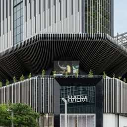
- Brand Identity for HAERA
- Ordinary People developed HAERA’s identity around the kanji character 栄, meaning flourishing. Its firelight and tree components were reinterpreted as conceptual substance and physical presence, shaping an evolving logotype system that connects the building with its inhabitants.
See all cases
Sign in to your Pro account to see all 9 cases for PARCO. Full client collections require Pro.
Sign in