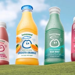
Innocent Drinks
Design work for Innocent Drinks, collected from the studios behind it.
- Design case
- 1
- Studio
- 1
- Latest work added
- Oct 2026
- Packaging 1
Design cases by studio
Derek & Eric (1)
- Packaging Redesign for Innocent Drinks
- Derek&Eric developed a packaging and identity system for Innocent Drinks. The work redraws the brand’s “dude” symbol with a smoother italicised form, enlarges it within compositions, and pairs it with a softened, arched Innocent wordmark. The system reduces variation across typography, colour, illustration, and photography to establish reusable assets for current and future product ranges.