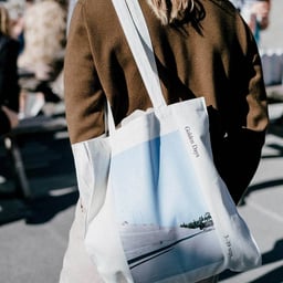
Golden Days
Design work for Golden Days, collected from the studios behind it.
- Design cases
- 3
- Studio
- 1
- Latest work added
- Jul 2025
- Brand Identity 2
- Editorial 1
Design cases by studio
Studio C (3)
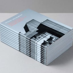
- Editorial Design for Golden Days Festival Guide to Brutalism
- Studio C created an editorial design for Golden Days’ 2016 cultural festival, themed around the 1970s. The book serves as a guide to Copenhagen’s Brutalist architecture, featuring black-and-white photography and a mechanical layout that reflects the raw, rational qualities of the movement.
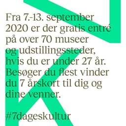
- Brand Identity for K7 Cultural Initiative
- Studio C developed the brand identity for K7, a nationwide initiative offering free access to cultural institutions for young people in Copenhagen. The logo was designed as a transparent stamp inspired by old-school ink stamps from nightlife venues, featuring bright colors and bold typography to appeal to a youthful audience.
- Festival Identity for Golden Days Antikken
- Studio C developed the festival identity for Golden Days’ 2021 edition, themed around Antiquity. The design draws inspiration from ancient Greek aesthetics, using Times typeface and a yellow palette to evoke classical references while maintaining a contemporary feel. The visual system bridges the past and present, reflecting the enduring influence of ancient culture on modern life.