Deutsche Telekom
Design work for Deutsche Telekom, collected from the studios behind it.
- Design cases
- 5
- Studios
- 2
- Latest work added
- Jan 2025
- Product Design 3
- Brand Identity 1
- Experience Design 1
Design cases by studio
Layer (3)
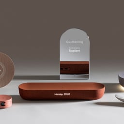
- Product Concept Design for Deutsche Telekom
- Connectivity Concept is an eclectic collection of six interconnected products developed in collaboration with Deutsche Telekom Design. The project explores how technology can seamlessly integrate into everyday life through cohesive product experiences.
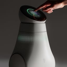
- Industrial Design for an AI-Based Home Companion Router
- Buddy is an AI-powered companion and mobile router designed to move around the home, offering both connectivity and assistive services. LAYER collaborated with Deutsche Telekom to create a functional yet approachable device that integrates technology seamlessly into daily life.
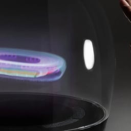
- Concept Design for a Holographic Home Hub
- View is a pioneering holographic home hub created as a concept vision for Deutsche Telekom. The project reimagines the brand’s services and hardware to explore a more immersive and connected future for home technology.
Yukiko (2)
- Event Identity for Telekom Electronic Beats Tour 2022
- Studio Yukiko developed a dynamic visual identity for the Telekom Electronic Beats Live Tour 2022, a multi-city European festival merging live music and digital experiences. The design centered around a digital cube concept, symbolizing the endless layers of electronic music culture and reflecting the platform’s 20-year legacy.

- Virtual Club Experience for Telekom Electronic Beats On Roblox
- Studio Yukiko created Beatland, a virtual clubbing world on Roblox for Telekom Electronic Beats. Drawing from Berlin’s techno culture and Kreuzberg’s brutalist architecture, the project merges nightlife aesthetics with digital interactivity. The immersive environment has attracted over 10 million visits since its launch.

Designers behind the work
Designers and creative leads credited on Deutsche Telekom projects in press coverage.