Warburtons Design Cases
2 cases across 2 studios

News & interviews
- Warburtons Gets New Logo, Identity, and Packaging
· Apr 6, 2026
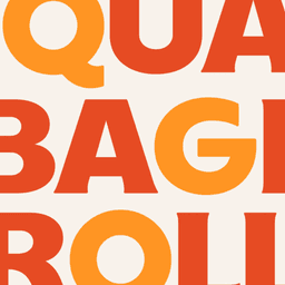
UnderConsideration’s Brand New reviewed the new logo, identity, and packaging for Warburtons, created by Taxi Studio in collaboration with Studio DRAMA. The rebrand refines the iconic orange look and introduces proprietary typography to modernize the UK bakery brand while maintaining its heritage.
Taxi StudioStudio DRAMAWarburtonsbranding - Taxi Studio's Warburtons Redesign is 'Bready To Go'
· Apr 2, 2026
Taxi Studio redesigned Warburtons’ packaging to celebrate the bakery’s 150th anniversary, unifying over 70 products under a cohesive identity. The refresh uses a signature 'Baked Orange' color, clean sans-serif typography, and subtle heritage details like the Family Seal of Quality and Jonathan Warburton’s signature. The result modernizes the brand while maintaining its trusted, familiar character.
Taxi StudioWarburtonsbranding - How Taxi Studio gave Warburtons a birthday makeover worthy of 150 years
Creative Boom · Mar 26, 2026
Creative Boom reports on Taxi Studio’s comprehensive rebrand for Warburtons, celebrating the bakery’s 150th anniversary. The Bristol-based studio introduced a cohesive packaging system centered on the brand’s signature 'Baked Orange' color, a refined wordmark, and a bespoke type family by Studio DRAMA. The redesign emphasizes warmth, heritage, and visibility across Warburtons’ extensive product range.
Taxi StudioStudio DRAMAWarburtonsbranding